Neutral Living Room Art: Calm Styling Ideas
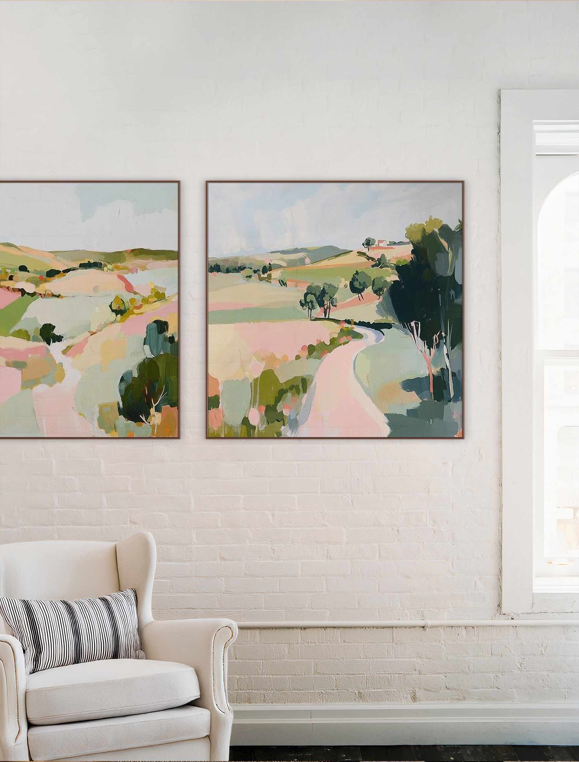
A pair of prints by Brenda Meynell, brings soft color, scale, and gentle contrast to a neutral living room.
Neutral living room art is the quiet workhorse of a calm, pulled-together room, and choosing it well is mostly about adding gentle contrast rather than blending in. If you've got soft walls and a blank space above the sofa, and this is a gentle, unhurried look at finding art that makes the space feel calm, personal, and quietly alive.
Neutral living room art should use soft color, clear scale, and gentle contrast to make the room feel calm without feeling bare. Good options include abstract prints, botanical art, black-and-white photography, soft nature scenes, and textured line work in cream, taupe, charcoal, beige, clay, and muted green.
The common worry is that neutral means flat or boring. It doesn't, as long as the art brings shape, texture, or one soft accent to the wall. A neutral room is really a blank stage, and the right piece is what gives it warmth and a point of view. Start by browsing living room art with a soft, calm palette in mind.
Key Takeaways
- Neutral living room art should add calm color, clear scale, and gentle contrast, not disappear into the wall.
- The two-thirds rule helps size art above a sofa, though pairs and gallery walls can work too.
- Abstract prints, botanical art, line work, photography, and soft nature scenes all suit neutral rooms.
- Cream, beige, gray, and wood-heavy rooms usually want one warmer or darker accent in the artwork.
- Frames change the mood of neutral art by adding warmth, lightness, definition, or polish.
What Makes Neutral Living Room Art Feel Calm?
Neutral living room art feels calm when it offers soft contrast rather than no contrast at all. A piece that's too pale or too close to the wall color tends to vanish, which reads as unfinished rather than serene.
The calm comes from balance, not the absence of color. Texture, shape, and negative space create quiet interest that holds the eye without demanding attention, so the wall feels considered even in a hushed palette. Think of a soft abstract with visible brushwork, a line drawing with plenty of open space, or a photograph with gentle gradients of gray. Each one gives you something to look at without raising the volume.
A small dose of muted accent color, clay, olive, charcoal, or warm ochre, can gently warm up a beige, gray, white, or cream room. It's the difference between a wall that recedes politely and one that quietly draws you in. The aim is a piece you notice and then relax into, not one that fades into the paint or competes with the sofa for attention.
Neutral Art Styles That Suit a Living Room
A few style families sit especially well in a neutral living room. Each keeps the room soft while adding its own kind of quiet interest, so it comes down to the mood you want.
Abstract Prints
Abstract prints suit modern and layered rooms, since shape and movement carry the interest without loud color. A soft, gestural piece in muted tones brings life to a plain wall while keeping the palette calm.
Botanical and Nature Art
Botanical prints and soft nature scenes add organic softness. Leaves, branches, and gentle landscapes feel warm and familiar, which suits a room built for relaxing.
Black-and-White Photography
Black-and-white photography adds contrast without introducing loud color. It's a clean, grown-up way to give a neutral room definition, especially against cream or greige walls.
Line Work and Minimal Forms
A simple line drawing or minimalist form suits small or quiet rooms beautifully. The delicate lines add just enough shape to feel intentional without crowding the space.
How to Choose the Right Size Above a Sofa
Art above a sofa usually looks balanced at about two-thirds of the sofa's width. That simple ratio solves most sizing questions, and the two-thirds rule is a guide rather than a strict rule. Run through this before you buy:
- Measure the sofa, then aim for art (or a grouping) about two-thirds as wide.
- Leave a comfortable gap between the top of the sofa and the bottom of the frame, so the wall can breathe.
- If one print feels too small, use a pair or a trio that adds up to the same span.
- Hang near eye level, and treat a grouping as a single visual unit.
- On a wide wall, go bigger than feels safe, since small art tends to look lost.
A quick example: a sofa around 84 inches wide often suits art, or a grouped set, close to 56 inches across.
Which Colors Work in a Neutral Living Room?
The palette that works usually repeats one or two room tones and adds a single quiet point of contrast. Matching every shade tends to flatten a wall, so a little contrast is what keeps it alive.
A cream room can take taupe, charcoal, clay, or soft olive without losing its warmth. A gray room often needs a little heat, from beige, ochre, sand, or a wood-toned frame, so it doesn't drift cool and flat. And a brown or wood-heavy room can lift with black, ivory, sage, or muted blue to keep all that warmth from feeling one-note. In each case, the art echoes what's already there, then adds one note the room doesn't have yet.
That single point of contrast is doing more than it seems. It gives the eye somewhere to land and signals that the wall was chosen on purpose. Without it, even a beautiful print can blur into the background. That's the difference between a wall that coordinates and one that quietly disappears.
A Simple Sofa-and-Wall Scenario
Picture a common setup: a beige sofa, a warm white wall, a wood coffee table, and one large blank wall to fill. A few directions feel lovely here, depending on the mood you're chasing, and none of them is the one right answer, it's art, after all.
Each keeps the room soft while giving that empty wall a clear purpose, so follow whichever one feels most like you.
How Frames Change the Mood of Neutral Art
Frames shape the mood of neutral art as much as the print's palette does. The same piece can feel warmer, lighter, or sharper depending on the frame you choose.
Natural wood frames add warmth and tie art to floors and furniture, which suits most relaxed, layered rooms. White frames feel light and airy, ideal for a bright, soft space where you want the art to float. Black frames give a neutral piece welcome definition and a bit of structure, and they're a quiet way to add the contrast a very pale room needs.
Metal frames suit a more polished, modern room, where a slim profile keeps things crisp. A wider mat is worth considering too, since the extra breathing room makes even a small print feel more intentional. It's worth picturing the frame as part of the artwork rather than an afterthought, since it does a lot of quiet work in a calm room.
How to Shop for Neutral Living Room Art on Artfully Walls
With a feeling in mind, the browsing gets easy. Filtering by room, color, size, and style turns a blank wall into a short, lovely shortlist, so you're choosing between a few pieces you already like rather than the entire internet.
At Artfully Walls, you can explore hand-picked living room art alongside framing choices and gallery wall tools for when a few pieces come together. Lean toward soft palettes and the scale your wall is asking for, and something personal and considered rises to the top.
FAQs
What art works well in a neutral living room?
Art that adds soft contrast, texture, and a clear focal point works well in a neutral living room. Abstract prints, botanical art, black-and-white photography, line drawings, and muted nature scenes all suit the room when the size fits the wall, and the palette repeats at least one room tone.
What is the 2/3 rule for wall art above a sofa?
The two-thirds rule says art above a sofa should be about two-thirds as wide as the sofa, which helps the wall feel balanced. A pair, trio, or small gallery wall can count as one visual unit as long as the group spans roughly the right width.
What are popular neutral art styles?
Popular neutral art styles include abstract prints, minimalist line work, botanical art, black-and-white photography, soft nature scenes, and textured geometric pieces. Each can feel calm when the palette stays muted, and the frame supports the room's existing materials.
Should neutral art match the sofa?
Neutral art doesn't need to match the sofa exactly. It's better to repeat one or two room tones and add a small contrast, such as charcoal, clay, olive, black, or warm white. Exact matching often makes the room feel flat rather than pulled together.
How do I make neutral wall art feel less boring?
Choose neutral art with shape, texture, line, shadow, or one muted accent color. A black frame, an organic form, a layered gallery wall, or a larger scale can all add interest while keeping the living room soft and calm.
Art included:
Valley landscape and Dreaming of Home both by Brenda Meynell
Published on: September 22, 2026 Modified on: September 22, 2026 By: Artfully Walls
Previous: Slow Living Art for Calm, Restful Homes Next: Moody Wall Art Ideas for Dramatic Rooms
