Moody Wall Art Ideas for Dramatic Rooms
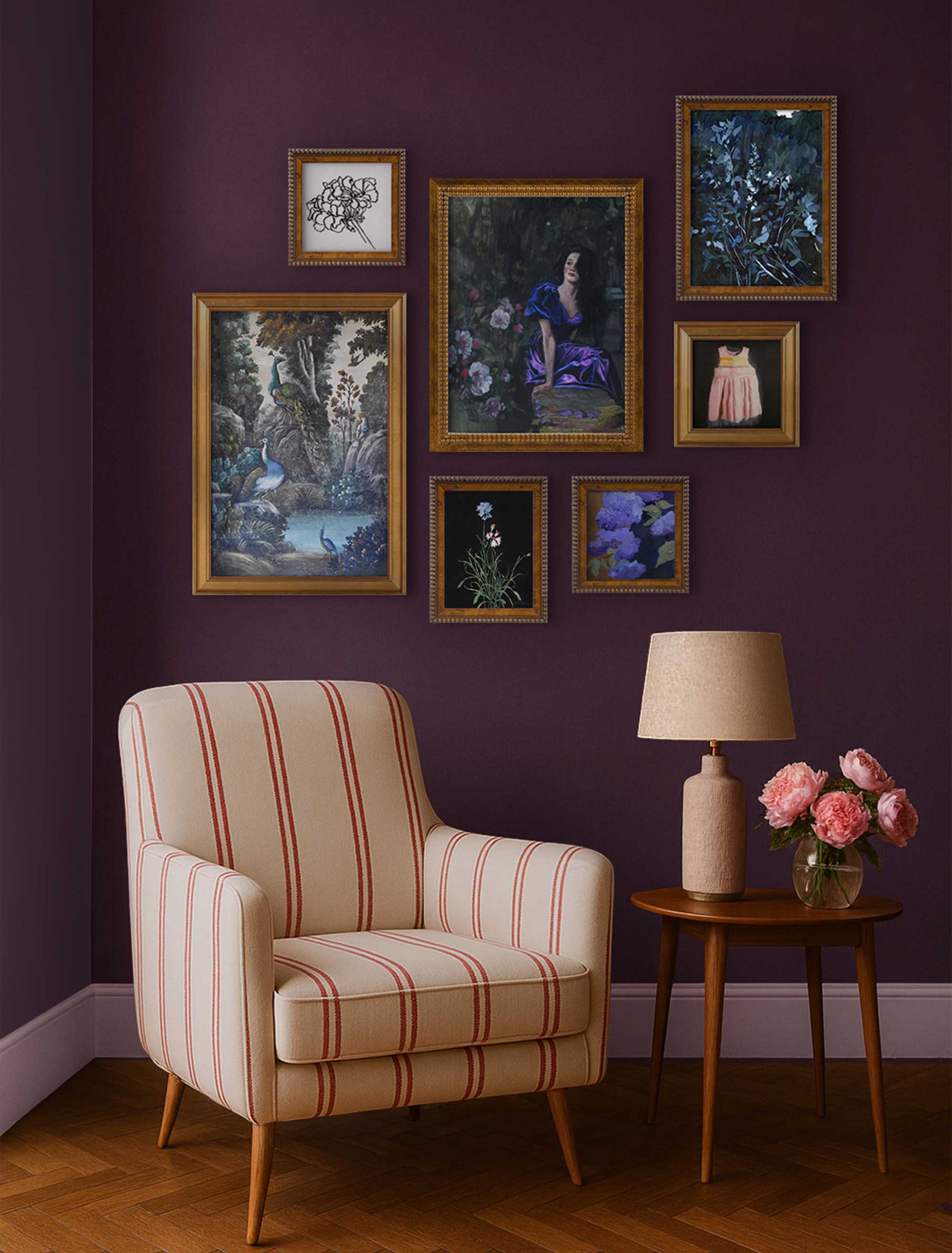
A moody gallery wall of deep florals, portraits, and abstracts shows how dramatic art can make a room feel rich rather than heavy.
Moody wall art is one of the easiest ways to make a room feel richer, more intimate, and more like yours. If you love the look online but worry it'll make your home feel heavy or gloomy, this is a friendly guide to finding a piece you'll love living with, and styling it so the room feels rich rather than heavy.
Moody wall art leans into deep color, soft shadow, and a little drama to give a room real atmosphere and warmth. The right piece plays off your room's light and mood, so it feels like an embrace rather than a weigh
Think of it as the "Vamp Romantic" side of decorating: atmospheric and a little mysterious, but still livable. Done with a light touch, one moody piece can anchor a whole room. Browse the art prints collection with a mood in mind, and the rest of this guide will help you choose.
Key Takeaways
- Moody wall art uses deep color, shadow, contrast, and expressive subjects to give a room a richer feeling.
- Subject matter sets the tone: romantic florals, quiet abstracts, dramatic portraits, or stormy water scenes each read differently.
- A dark piece can work in a bright or small room when the scale, mat, and frame give it breathing room.
- The two-thirds rule is a reliable starting point for sizing art above a sofa, bed, or console.
- A moody gallery wall can go all-in with deep, dramatic prints together, or let one anchor lead with softer pieces around it. Both are gorgeous
What Is Moody Wall Art?
Moody wall art uses deep tones, shadow, and expressive subjects to shape the feeling of a room. It's about atmosphere and contrast more than any single dark color, which is why it can feel romantic in one room and calm in another.
Subject does a lot of the work here. A dramatic portrait brings tension and personality, a stormy seascape carries quiet drama, and a deep, lush floral feels romantic rather than sweet. The same goes for abstracts, forest scenes, and shadowy still lifes: depth and expression make them moody, not just the palette. Frame choice and wall color then tune the final effect, softening a piece or heightening it. None of this means gothic styling or black walls, just art with a little more depth than the safe, pale option.
Why Moody Art Works in Dramatic Rooms
Moody art gives a dramatic room a clear focal point. Deep color naturally draws the eye, so a single strong piece can pull a whole seating area together and make it feel intentional rather than decorated one object at a time.
It also holds its own. Where a pale print can disappear against textured furniture, full bookshelves, or layered lamplight, a moody piece has the weight to stand up to all of it. That's what makes a den, a reading corner, or a dining room feel enveloping and warm, the kind of space you want to linger in once the lights are low.
Choose the Mood Before the Print
The right moody print starts with the feeling you want the room to hold. Naming that first makes every other choice, subject, color, scale, easier. Here's how the mood can shift by room:
- Bedroom: calm and enveloping, with softer contrast and personal subjects. A quiet piece over the bed sets the tone without keeping you up.
- Living room: a dramatic anchor at a bigger scale and stronger contrast, since the room can carry it.
- Dining room: romantic and candlelit, with richer subject matter like deep florals or a shadowy still life.
- Home office: focused and grounded, with less visual noise, so one deep piece steadies the room rather than distracting.
Color Palettes That Keep Moody Art Livable
Moody color feels livable when deep tones are balanced by softer surfaces nearby. The goal is depth with a little air, not a room that closes in on you.
A few pairings tend to sit beautifully: charcoal with cream, oxblood with walnut, indigo with linen, olive with brass, and near-black with warm white. The trick is restraint. Rather than matching every color in the print to the room, repeat just one or two, and let the lighter surfaces around the art do the balancing.
A wider mat or a paler frame gives a wall more room to breathe. Or go the other way entirely: a gold or brass frame with no mat at all is stunning on a moody print, letting the color pour right to the edge while the warm metal catches the light. Airy or lush, both are lovely, it just depends on the feeling you're after.
Subjects for the Vamp Romantic Look
The Vamp Romantic look leans on subjects that feel layered, intimate, or a little mysterious. A few directions give you a clear place to start browsing.
Portraits
Portraits bring instant tension and personality to a wall. A face in shadow, or a figure caught mid-thought, gives a room a sense of story that abstract color alone can't, which makes it a strong anchor above a console or mantel.
Deep Florals
Botanical prints turn romantic when the colors go deep rather than sweet. Think dusky roses, near-black leaves, and moody backgrounds, the lush, painterly end of florals rather than the pastel one.
Quiet Abstracts
Abstract prints let color and movement carry the mood without a fixed subject. A dark, gestural piece brings drama and flexibility at once, since it reads differently depending on the room around it.
Water and Forest Scenes
Stormy seascapes and shadowed forest and landscape scenes offer a quieter kind of drama. Mist, deep greens, and low light feel atmospheric and calming at the same time, ideal when you want mood without intensity.
How to Size Moody Wall Art for Your Room
Moody wall art usually looks right when it spans about two-thirds of the furniture below it. Because dark pieces carry visual weight, getting the scale right matters even more than usual. Run through this before you buy:
- Measure the sofa, bed, or console, and aim for art about two-thirds of that width.
- Leave breathing room around a dark piece so it doesn't crowd the wall.
- On a wide wall, choose one large anchor or a grouped set that adds up to the same span. An oversized print earns its place here.
- Match orientation to the space: vertical for narrow walls, horizontal for a furniture run.
- Hang near eye level, so the piece feels anchored rather than floating.
A quick example: a sofa around 84 inches wide tends to suit art or a grouped set near 56 inches across.
How to Build a Moody Gallery Wall Without Visual Clutter
A moody gallery wall can go two beautiful ways. Let every print be deep and dramatic, held together by a shared richness of tone, or let one show-stopper lead with quieter pieces gathered around it. Either way, the magic is in the tones talking to one another.
One combination to try: a deep, dramatic anchor, two mid-tones that echo its warmth or coolness, and maybe a paler print so the eye can rest. Or go all in, and let the whole wall smolder. Keep the frames related, all warm wood, gold, brass, or all black, and use generous, even spacing so the darker pieces have room to breathe.
Mixing subjects is welcome, as long as the color temperature stays consistent, so the group reads as one collected idea. For a sense of how a set can carry mood together, this moody abstraction gallery wall shows the balance in action.
Bringing Moody Wall Art Home
The best part comes once you've landed on a mood and a wall: finding the piece itself. Browse with a feeling in mind, then let a few filters for color, size, and orientation do the sorting, and a sprawling search becomes a short, tempting shortlist.
At Artfully Walls, you can wander hand-picked art prints by room, style, color, size, and orientation, with framing and ready-made gallery walls for when one piece turns into a few. Everything's printed on museum-quality archival paper, so the depth you fall for on screen shows up, rich and true, on your wall. Find one piece you keep coming back to, and let the room grow around it.
Start with a mood and a wall, filter down to a handful of deep, expressive art prints, and the choosing gets a lot calmer than an open search ever feels.
How to Keep a Moody Room Feeling Light
Moody rooms tip into heavy when every choice competes for attention. The fixes are gentle, and mostly about letting one thing lead.
Lean on a few strong pieces rather than a scatter of dark accents, and let one print be the clear lead with quieter supporting works around it. Add light wherever you can, through a wider mat, a paler frame, a nearby lamp, or a lighter textile, so the depth has something to play against.
Watch the scale too, since an undersized dark piece can look lost rather than intentional. Handled this way, a moody room reads as rich and considered, not gloomy.
FAQs
What is moody wall art?
Moody wall art uses deeper colors, shadow, contrast, and expressive subject matter to create a richer room feeling. It can include portraits, deep florals, abstracts, seascapes, forest scenes, and shadowy still lifes, chosen for atmosphere rather than dark color alone.
What is the 2/3 rule for wall art?
The two-thirds rule means wall art should usually be about two-thirds as wide as the furniture below it. A sofa that's 84 inches wide often suits art, or a grouped set, around 56 inches wide, so the wall feels balanced.
Can moody wall art work in a small room?
Yes. Moody wall art can work in a small room when the piece has breathing room around it, the frame or mat adds a little contrast, and the rest of the room keeps enough light surfaces to balance the depth.
What kind of wall art is trending right now?
Current wall art trends include darker, romantic rooms, expressive portraits, organic abstracts, layered gallery walls, and art chosen by feeling rather than strict color matching. Depth and personality are leading the mood this year.
Art included:
Single Geranium by Megan Williamson, Pride and Passerine by Jennifer Lanne, Before the sunrise by Hannah Barlag, Cornflowers from the Garden by Janel Bragg, Lilac Time by Toby Gordon, Her by Stephen Coyle, Blue 2 by Jennifer L Mohr
Published on: September 22, 2026 Modified on: September 22, 2026 By: Artfully Walls
Previous: Slow Living Art for Calm, Restful Homes
