What Is the 2/3 Rule for Wall Art? A Simple Guide to Perfect Placement
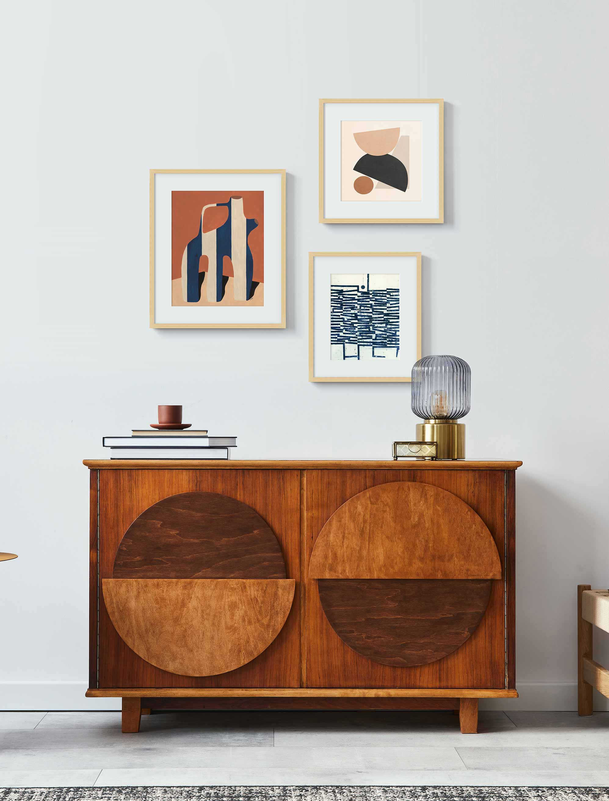
An example of 2/3 wall art placement in a modern living room.
Hanging art can feel like a guessing game, but the 2/3 rule gives you a reliable starting point. It is not about strict measurements or following rules to the letter. Instead, it is a simple proportion that helps your artwork feel connected to the furniture and space around it.
The idea is that your art should take up roughly two-thirds of the width of the piece of furniture below it, whether that is a sofa, bed, or console. This keeps things looking balanced and intentional without the art feeling too small or overpowering. Think of it less as a rule and more as a rhythm that brings harmony to a room.
Key Takeaways
- The 2/3 rule suggests your artwork span about two-thirds of the width of the furniture beneath it, creating balance and proportion.
- It works for both single statement pieces and grouped arrangements like gallery walls.
- You can use it as a guide for choosing sizes and planning spacing without worrying about being exact.
- Many designers adjust the rule depending on ceiling height, furniture style, or personal taste: so it is flexible, not fixed.
Understanding the 2/3 Rule: Definition and Origins
At its heart, the 2/3 rule is about proportion. When art is proportional to the furniture it hangs above, the whole setup feels visually grounded. This idea comes from long-standing design traditions that value balance and harmony, much like the golden ratio in architecture or the rule of thirds in photography.
The reason it works is simple: our eyes like order. A piece that is too small can look like it is floating in space, while one that is too large can feel heavy or overwhelming. Aiming for two-thirds of the width of your sofa, headboard, or console creates a natural connection that feels right without needing to measure down to the millimeter.
How to Apply the 2/3 Rule in Different Scenarios
The beauty of the 2/3 rule is that it adapts easily to many situations. Whether you are hanging one large piece or building a gallery wall, the guideline gives you a framework for scale that you can then adjust to suit your style.
Single Artwork Placement
For one big canvas or framed print, measure the furniture below and aim for your art to cover about two-thirds of that width. For example, if your sofa is 90 inches long, a piece around 60 inches wide will feel balanced.
Gallery Wall Applications
When creating a gallery wall, think of the entire arrangement as one piece. The combined width of all the artworks, plus the spacing between them, should be about two-thirds of the furniture beneath. This keeps even busy arrangements looking anchored rather than scattered.
Furniture Relationship Guidelines
Different types of furniture can affect how you read the 2/3 rule. A deep sectional may call for a larger piece, while a narrow console may look better with something lighter. Use the guideline as a starting point, then adjust depending on the furniture’s height, depth, and style.
Wall Space Calculations
If the wall itself feels oversized compared to your furniture, let the furniture guide you rather than the whole wall. The two-thirds should relate to the sofa or bed beneath, not necessarily the full expanse of the wall. This keeps the art tied to your furnishings and avoids the “lost on the wall” effect.
If you want to experiment with layouts before committing, try the Artfully Walls Wall Designer. It lets you preview how different prints and frames will look together so you can find the arrangement that feels just right.
Height Positioning Standards
Once you’ve sorted out width, consider height. Centering the art around eye level (roughly 57–60 inches from the floor) works well for most rooms. When hanging above furniture, keep a small gap between the top of the furniture and the bottom of the frame so the pieces feel connected but not crowded.
2/3 Rule for Wall Art in Every Room: Practical Examples
The 2/3 rule works across your home, but it shows up a little differently in each room. The goal is always the same: balance art with the furniture beneath it so the wall feels intentional and tied into the space.
Living Room Artwork Sizing
Above a sofa or sectional, the 2/3 rule helps the art anchor the seating area. One large canvas or a gallery wall with consistent spacing can create a focal point that draws the eye without overwhelming the room.
Bedroom Wall Art Guidelines
Your headboard is the natural anchor here. A piece or set of pieces that span about two-thirds of its width feels calm and proportional. This keeps the artwork restful and supportive of the bedroom’s mood.
Dining Room Display Standards
The rule helps balance artwork above sideboards or buffets in dining areas. Because these pieces of furniture are often long and low, a horizontally oriented artwork or a row of smaller prints spanning two-thirds of the width works beautifully.
Office and Study Applications
Art hung above a desk or bookcase in workspaces benefits from the same approach. The 2/3 guideline ensures that the art is visually tied to the furniture, helping the room feel composed and professional while still personal.
When to Break the 2/3 Rule: Exceptions and Alternatives
Like all design guidelines, the 2/3 rule is there to help, not to restrict you. Sometimes breaking it is exactly what gives your wall its character.
High Ceiling Adaptations
If your room has soaring ceilings, sticking strictly to two-thirds can leave art feeling too small. In these cases, go bigger. Fill more vertical space or layer multiple works to balance the room's scale.
Minimalist Design Approaches
In minimalist spaces, less can feel like more. Hanging a smaller piece that takes up less than two-thirds of the furniture’s width can create a quiet, calming moment. The negative space becomes part of the design.
Statement Piece Strategies
Every so often, a single oversized piece demands the spotlight. Letting it spill beyond two-thirds can create drama and establish a strong focal point. As long as it feels intentional, it works.
Architectural Feature Considerations
Fireplaces, windows, or built-ins often break the rhythm of a wall. In those cases, the 2/3 guideline may not apply neatly. Instead, work with the existing architecture, centering or aligning your art to complement those features.
Common 2/3 Rule Mistakes and How to Avoid Them
The 2/3 rule is simple, but there are a few easy pitfalls. Luckily, they’re also easy to avoid.
Measurement Calculation Errors
One of the most common mistakes is measuring the wall instead of the furniture. Always measure the furniture width first, then calculate two-thirds of that for your artwork or gallery arrangement.
Furniture Scale Misjudgments
Large, heavy furniture needs equally strong art. Small, delicate furniture pairs better with lighter pieces. Ignoring this balance can make the art feel disconnected from the room.
Multiple Piece Coordination
When working with a gallery wall, think of the collection as one large piece. If the overall width doesn’t add up to about two-thirds of the furniture, the display can look either cramped or too spread out.
Room Context Oversights
Remember to consider ceiling height, wall size, and the room’s function. A piece that works beautifully in a dining room might look lost in a double-height living space. Context matters as much as measurement.
Master Perfect Wall Art Placement With the 2/3 Rule
The 2/3 rule takes the stress out of hanging art. It gives you a framework that makes proportion feel effortless, while still leaving room for creativity and personal style. Think of it as a starting point, not a strict formula.
Using this guideline with framed prints, canvases, or a gallery wall creates balance and harmony in your space. And when you decide to break it, you do so with intention. That is the sweet spot where your walls look both professional and personal.
FAQs
What exactly is the 2/3 rule for wall art placement?
It is a guideline that suggests your art should span about two-thirds of the width of the furniture beneath it, creating a balanced relationship between the two.
How do you measure wall art using the 2/3 rule?
Measure the width of your furniture, multiply by 0.66, and use that number as your target width for the art or arrangement.
Does the 2/3 rule apply to all wall art sizes?
Yes, but it adapts. It works for single pieces, gallery walls, and even layered arrangements. The idea is proportion, not perfection.
Should I follow the 2/3 rule for gallery walls too?
Definitely, just think of the gallery wall as one overall shape. The frames' combined width and spacing between them should be about two-thirds of the furniture width.
Art Included:
Hidden Depths 1. by Petr Strnad
Abstract Art - T04 by Jaqueline Lima Vera
Published on: September 29, 2025 Modified on: June 19, 2026 By: Artfully Walls
Previous: Get to Know Adrienne Brown-David — Artist Who Captures Childhood Memories Next: Are Gallery Walls Still in Style? A 2025 Guide to This Classic Trend
