Colorful Abstract Art: Bold Color Ideas for Your Home Walls
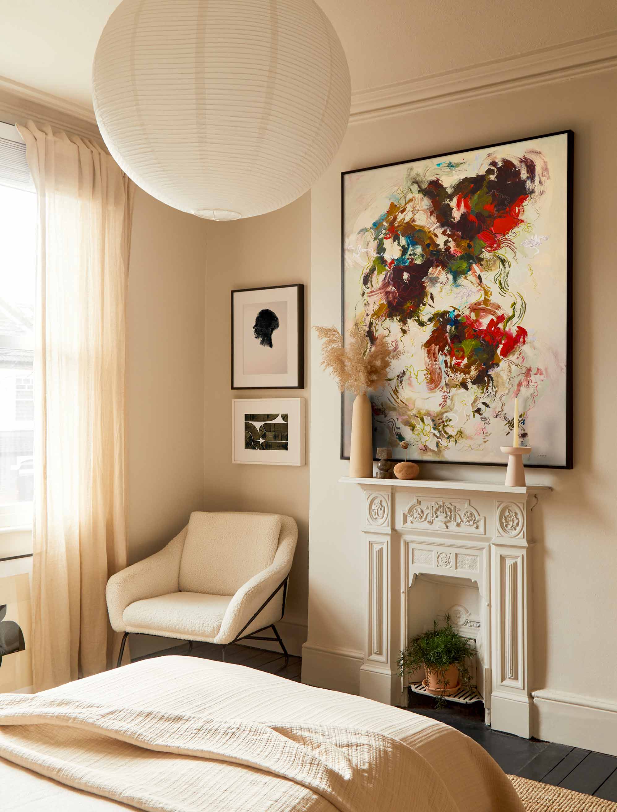
Bold color doesn't have to shout to make a room feel like yours.
Colorful abstract art brings movement, mood, and personal color into a room without asking you to commit to a full redesign. If bold art has ever felt hard to place, this is a practical walk-through choosing it with confidence, by room, color, size, and framing.
Colorful abstract art uses shape, movement, and strong color to set the mood of a room. Choose it by matching one dominant color to your space, picking a scale that fits the wall, and using framing to make the piece feel intentional.
The worry most people have is the same: that a bright, expressive piece will make a room feel loud or mismatched. It won't, as long as you let one color lead and give the art a little room to work. It helps to see colorful abstract art as one of the friendliest ways into the wider wall art trends right now, warmer, more personal rooms that actually feel like someone lives in them.
Key Takeaways
- Colorful abstract art sets a room's mood through color, shape, and movement rather than subject matter.
- A room feels more balanced when one color leads and the others support it.
- Large abstract prints work well when the wall and furniture give them room to breathe.
- Small abstract prints can work as pairs, shelf art, bathroom art, or accents in narrow spaces.
- Framing connects bold color to the rest of the room.
- Artfully Walls supports abstract shoppers with hand-picked prints, framing options, and room-led browsing.
Why Colorful Abstract Art Is Back in Focus
Colorful abstract art is having a moment because it adds energy and personality to a room without a full makeover. One expressive print can shift the whole feeling of a space, which is a lot of return for a single decision.
Abstract forms are part of the appeal. Because there's no fixed subject to decode, you get to respond to color, shape, and movement on your own terms, and the piece can mean whatever it means to you. That freedom is exactly why it suits so many homes, not only modern ones. A colorful abstract can just as easily warm up a traditional room, a cottage kitchen, or a plain rental wall, since it borrows its mood from color rather than a particular era.
Most pages you'll find on this topic are product grids that skip the styling help, so it's worth slowing down on the how. If you want to browse as you read, the abstract art prints collection is a good place to see the range. The reassuring part: you can start with one print, not a whole-room refresh.
How to Choose Colors That Feel Bold but Balanced
The simplest rule is to choose one dominant color, one supporting color, and one quiet note pulled from the room, the same instinct behind choosing any wall art with confidence. That structure lets a piece feel bold without competing with everything around it.
Start by borrowing a color you already live with, from a rug, sofa, bedding, tile, or a favorite object, so the art feels connected from day one. Then let a single color lead rather than trying to match every shade in the room.
A few combinations that tend to sit well: blue with warm wood, pink with cream, or a punchy yellow steadied by a black frame. Here's a quick way to pressure-test a piece before you buy:
- Does one color clearly lead, rather than several fighting for attention?
- Is there a supporting color that ties it to the room?
- Is there a quiet neutral or some white space to give the eye a rest?
- Does at least one color echo something you already own?
- Would a simple frame or mat calm the palette if it feels too strong?
If most of those check out, the piece will likely feel bold and balanced rather than chaotic.
Where Colorful Abstract Prints Work Best by Room
Each room asks a slightly different job from color, so it helps to match the piece to the space. What reads as energizing in one room can feel like too much in another, and scale plays into it as much as palette.
Living Rooms
Living rooms can usually carry the largest color fields, since they tend to have the biggest wall area and the most foot traffic. A generous abstract over the sofa gives the room a confident anchor, and because it's a social space, a little energy is welcome. If one print feels like a lot of pressure, a set of coordinated pieces in a living-room gallery wall spreads the color across the whole wall instead.
Bedrooms
Bedrooms tend to want softer contrast or one calm dominant hue. You can still go colorful here, just dial down the clash: a single expressive piece in a gentler palette keeps the room restful while still feeling personal.
Bathrooms and Entryways
Bathrooms and entryways are great places to be playful, because they're small, contained spaces where a hit of color feels like a nice surprise rather than a commitment. These are the spots to try a bolder piece you might hesitate to hang in a bigger room, and a considered grouping like a bathroom gallery wall can turn an overlooked wall into a moment.
Dining Rooms and Home Offices
Dining rooms can take a lively, conversation-starting piece, while a home office benefits from color that adds focus without visual noise. In a workspace, one grounded color usually beats a busy mix, so the wall energizes without pulling your attention off the task.
How Size Changes the Feeling of Abstract Art
Scale changes how color reads on a wall as much as the palette does. The same print can feel like a gentle accent or a bold statement depending on how large it is and how much space surrounds it.
Small abstract prints work nicely in pairs, on shelves, in powder rooms, and along narrow walls, where you take them in up close. Medium and oversized prints can anchor a sofa, a bed, a dining table, or a blank entry wall, ideally spanning about two-thirds of the furniture below so the scale feels right. And when one print doesn't feel like enough, a gallery wall lets several pieces share the color story so no single frame has to do all the work.
If that's the direction you're leaning, a grouping like this bold, abstract gallery wall shows how a set can carry color together. Match the scale to your wall width and the furniture below, and the color falls into place.
Two Scenarios: Small Rooms and Large Blank Walls
The size of the wall should guide the color plan more than any rule. Here are two quick examples to make that concrete.
In a small room, a powder room, a hallway, or a home office nook, reach for one smaller print with a single clear color note and a simple frame. It becomes a bright focal point without crowding the space, and the surrounding wall gives it room to land. A pair of small prints can work too, as long as they share a palette.
On a large blank wall, above a sofa or a bed, scale up. One oversized print, or a coordinated pair with space around it, fills the wall with confidence. If a single piece still feels like a lot to commit to, a gallery wall spreads the color across several frames and often feels friendlier than one giant statement. Leave breathing room around the whole arrangement so the color has somewhere to go.
How Framing Makes Bold Abstract Art Feel Intentional
Framing is the bridge between the art and the room. The right frame can settle a high-color piece into a space so it looks chosen rather than propped up.
A few simple leanings: black frames sharpen bright, high-contrast pieces and add structure, white frames soften color and suit light, airy rooms, and natural wood adds warmth while tying the print to your furniture or floors.
A wider mat gives busy color room to breathe, and a slim frame keeps things modern. Framing options let you shift the whole mood of a piece, so it's worth picturing the frame as part of the art rather than an afterthought.
How to Shop Colorful Abstract Art on Artfully Walls
Artfully Walls lets you move from inspiration to a specific abstract print by narrowing what you already know you want. Start broad, then filter by the room, color, and scale you have in mind.
The abstract collection is the natural starting point, with hand-picked fine art prints from rising and established artists. From there you can browse by room, art style, decor style, color, size, and orientation, or use gallery wall options to plan a grouping.
Prints are made on museum-quality archival materials, so the color stays true once it's on your wall. Choose one piece that speaks to you, build the room around it, and the whole space starts to feel more like yours.
FAQs
What colors are best for abstract art?
Follow the room's mood rather than a single rule. Pick one dominant color from your decor, add one supporting shade, and keep a quiet neutral nearby, so the print feels bold without taking over the space.
What are the four types of abstract art?
Common groupings include geometric abstraction, lyrical abstraction, abstract expressionism, and color field painting. For decorating, though, a more useful lens is mood, color, scale, and how the piece works with your room.
Is colorful abstract art good for small rooms?
Yes. In a small room, choose one clear focal print, leave breathing room around it, and use simple framing. A smaller colorful piece can make a powder room, hallway, or office feel finished rather than crowded.
How do I know if abstract art works with my decor?
Abstract art works when at least one color, texture, or mood connects to the room. It doesn't need to match exactly. Look for a shared undertone, a frame finish, or a repeated shape to tie it in.
Where can I buy colorful abstract art prints online?
Artfully Walls has a curated abstract print collection with options by color, size, style, orientation, and framing. Start with the abstract category, then narrow by the room and mood you want.
Image credit: A Dizzy Joy Modern Abstract by Megan Cassidy Carty, Head 259 by Michael Lentz, Bends of Bamboo 2 by Evgeny Vitrov.
Published on: August 14, 2026 Modified on: August 23, 2026 By: Artfully Walls
Previous: Master Bedroom Wall Art Ideas: 10 Ways to Choose Art Next: How to Plan a Kitchen Gallery Wall
