How to Plan a Kitchen Gallery Wall
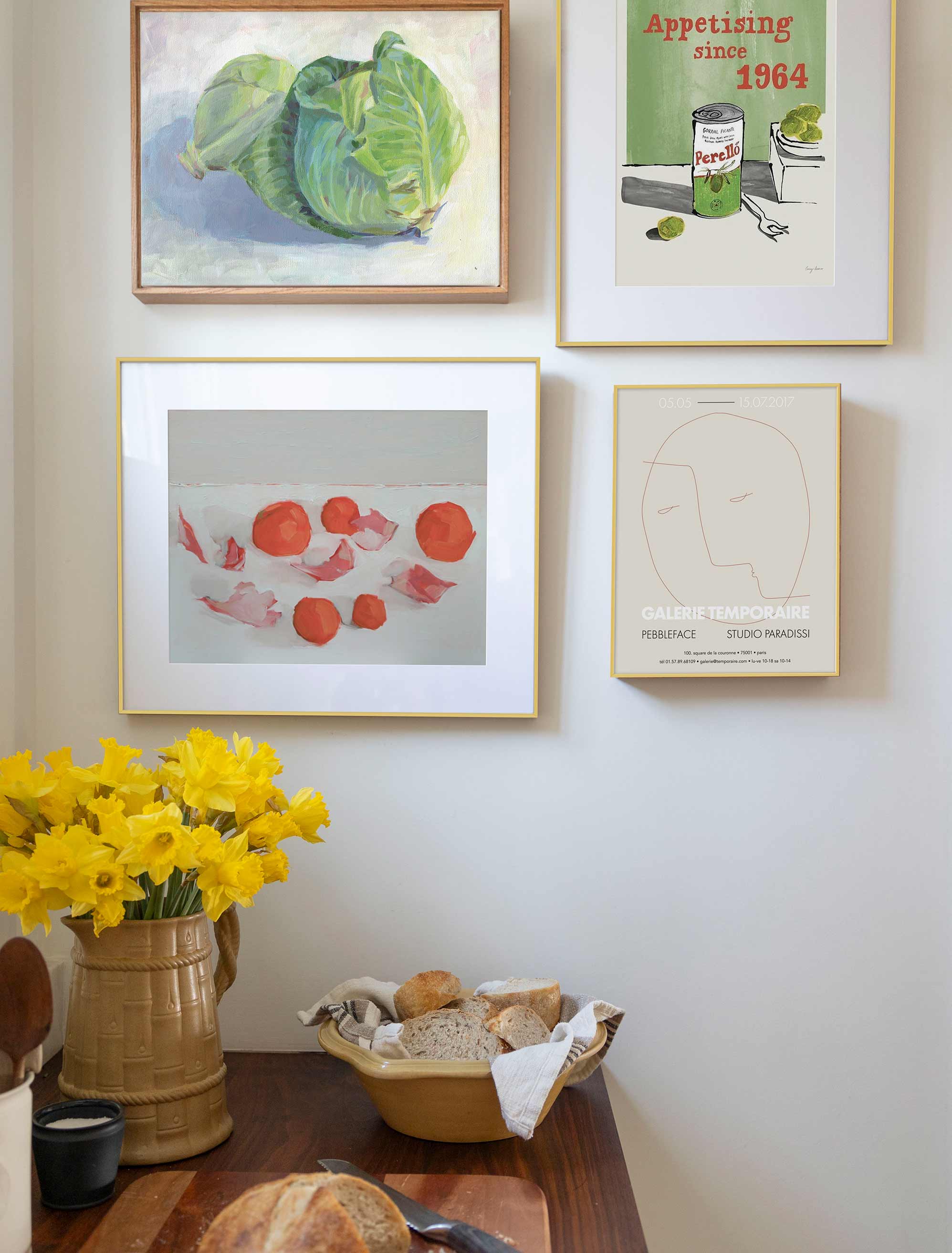
A well-planned kitchen gallery wall pairs the right art, size, and spacing to make the room feel warm and personal.
A kitchen gallery wall is one of the warmest things you can do for a room that's usually all cabinets and hard surfaces. If you've got a blank wall by the table or above a counter and no idea where to start, this is a calm, step-by-step way to fill it with art you love.
A kitchen gallery wall is a group of framed prints, photographs, or small art objects arranged together to bring warmth and personality to a kitchen. Start with a theme, measure the wall, choose one anchor piece, lay the arrangement out on the floor first, then hang everything with even spacing.
The kitchen can feel like a tricky place to hang art, with all its cabinets, appliances, and everyday clutter, but that's exactly why a considered grouping works so well here. Browse kitchen wall art with a mood in mind, and this guide will walk you through the rest.
Key Takeaways
- A kitchen gallery wall works best when it's planned around the wall size, sightlines, and the finishes already in the room.
- Kitchen art doesn't have to be food-themed; botanicals, abstracts, still lifes, and photography all belong here.
- One anchor piece helps a mix of sizes feel collected rather than random.
- Laying the arrangement out first, on the floor or with paper, takes the nerves out of hanging.
- Art near heat, steam, and splashes is happiest on a wall a step removed from the action.
What Makes a Kitchen Gallery Wall Work?
A kitchen gallery wall works when the art suits the room's scale, its colors, and the mood you want at mealtime. The kitchen has a lot going on already, so the trick is to let the wall feel like a calm counterpoint rather than one more busy surface.
Scale is the first thing to get comfortable with. Art that's too small can look accidental against cabinets and counters, so give the grouping enough presence to hold its own. Color is the second: pulling a tone or two from your cabinetry, tile, hardware, or a favorite textile ties the whole thing to the room. And mood is the fun part: playful, quiet, vintage, modern, or collected-over-time. Once you know the feeling you're after, the pieces start to choose themselves.
Placement matters too, since a kitchen wall rarely stands alone. A grouping over a breakfast table, along an empty stretch beside the pantry, or filling the gap between upper cabinets and the counter all read differently, and each wants art sized to its own little pocket of space. Look at the wall in the context of everything around it, and the right scale usually becomes obvious.
Choosing a Theme for Your Kitchen Wall
A kitchen gallery wall theme should come from the feeling you want at the table, not from a rule about what belongs in a kitchen. Food art is welcome, but it's far from the only option, and mixing in non-food pieces often makes the wall feel more personal.
Botanicals and Still Life
Botanical prints and a classic still life feel right at home in a kitchen without leaning on clichés. Herbs, fruit, a simple vessel, all of it suits the room while staying quietly elegant.
Soft Abstracts
Abstract prints bring color and movement without a subject to overthink, which makes them an easy bridge between food art and something more modern. One gestural piece can anchor a whole grouping.
Vintage, Travel, and Black-and-White
A little vintage charm, a travel memory, or a low-contrast black-and-white photograph all add character. These pieces make a wall feel like yours, collected over time rather than bought in one go.
The one thing worth holding onto is a single connecting thread, a shared palette, a repeated frame finish, or a common mood, so a varied mix still reads as one collected idea.
How to Size and Arrange It
A kitchen gallery wall starts with the wall measurement and one anchor piece. Measure the open space first, then let your largest or most expressive print set the tone for everything around it.
From there, the arrangement is yours to play with. A tidy grid feels crisp and modern, a looser cluster feels collected and organic, and a vertical stack suits a narrow strip beside a doorway or window. A ledge or picture rail is worth a thought too, since it lets you lean and rearrange pieces without a single extra nail hole, which is handy in a room where things evolve.
Keep the spacing even, usually somewhere around two to three inches between frames, so the group reads as one shape. If your wall sits above a table, sideboard, or run of counter, the two-thirds rule is a friendly starting point: aim for a grouping about two-thirds as wide as the furniture below.
And leave a little air around cabinets, windows, and shelves, so the wall feels considered rather than crammed. A symmetrical grid isn't the only polished look, either; a balanced but slightly irregular cluster can feel just as intentional and a little more relaxed.
Before You Hang
A little planning before you pick up a hammer saves a lot of second-guessing later. A few things worth doing first:
- Lay the whole arrangement out on the floor, or cut paper templates, and shuffle until it feels right.
- Check the view from the doorway and from where you sit at the table, since those are the angles you'll see most.
- Choose a wall a step removed from the stovetop and sink, so steam, grease, and splashes stay off the art.
- Settle on your frame finish and any mats before you commit, so the whole group feels cohesive.
- Keep a level, a pencil, a tape measure, and a little painter's tape handy for clean, even spacing.
If you'd like the full walk-through, here's how to make a gallery wall from first pick to final nail.
A Small Kitchen or Breakfast Nook
A small kitchen gallery wall works best with fewer pieces, one clear anchor, and a little room to breathe. In a tight space, restraint is what keeps the wall feeling calm rather than crowded.
Picture a narrow breakfast nook with one open wall above the bench. Three to five prints is plenty here: one anchor piece slightly larger than the rest, two or three smaller supporting pieces around it, and a palette held to a couple of soft, related tones.
A vertical stack can be lovely on a skinny wall beside a window, drawing the eye up rather than out. If you'd like to see it all come together before you buy, the gallery wall planner lets you arrange everything on a scaled wall and swap pieces around until it feels right.
What Keeps a Kitchen Gallery Wall Feeling Effortless
A kitchen gallery wall stays effortless when the pieces feel connected, and the spacing has room to breathe. A few gentle habits keep it looking collected, not chaotic.
Go a size up if you're torn, since art that's a touch too small can get lost on a big kitchen wall. Keep the gaps even and the palette friendly, so a mix of subjects still hangs together. Let frames nod to the room's finishes rather than fight them: warm wood with warm wood, black with black hardware.
And give the art a wall that stays fairly clear of heat and splashes, so it looks as good in a year as it does on day one. Small choices, big difference.
Where to Shop Once Your Plan Is Set
Once you know your wall size, palette, and mood, the shopping part gets genuinely enjoyable. With a plan in hand, you're choosing between a few pieces you love rather than the whole internet.
At Artfully Walls, you can explore hand-picked prints and browse by style, color, size, and orientation, then see them come together as ready-made kitchen gallery walls if you'd rather start from a grouping than build one from scratch. Everything's printed on museum-quality archival paper with framing built in, so the wall you plan is the wall you get. Pick the pieces that make you happy, and let the room warm up around them.
There's no rush to finish it all at once, either. A kitchen gallery wall can start with one anchor piece you love and grow over time, adding a print here and there as you find them. That slow, collected approach is often what gives a wall its personality in the first place, so let it be a work in progress if that feels more like you.
FAQs
Are gallery walls out of style in 2026?
Gallery walls are still very much in style when they feel personal and edited rather than crowded. In a kitchen, keep the palette tied to your cabinets and finishes, leave a little space around each frame, and the arrangement feels current and warm.
What art works well in a kitchen?
Art that suits the room's mood and placement works well in a kitchen. Botanical prints, still lifes, abstracts, vintage pieces, and black-and-white photography all fit beautifully when the size suits the wall, and the colors nod to the room.
What is the rule for gallery walls?
The most useful approach is to treat the whole arrangement as one shape. Keep the spacing steady, let one anchor piece lead, and size the group to suit the furniture or open wall below it.
What are common gallery wall mishaps to avoid?
The usual ones are easy to sidestep: starting without measuring, choosing lots of tiny pieces, hanging frames too high, or mixing styles with nothing to connect them. A shared color, subject, or frame finish keeps everything feeling intentional.
How many prints should go in a kitchen gallery wall?
Most kitchen gallery walls sit happily with three to seven prints. A narrow nook might want just three, while a broad blank wall can carry five to nine, as long as the spacing stays even and the palette stays connected.
Art included:
Green Cabbage by Carrie Arnold
Perelló Olives by Lucy Deaner
Galerie Temporaire 09 by Eleni Psyllaki
Petals and Kumquats by Lynne Millar
Published on: September 24, 2026 Modified on: September 30, 2026 By: Artfully Walls
Previous: Moody Wall Art Ideas for Dramatic Rooms
