Scribbles, Sketches, and Freehand Flair: The Case for Imperfect Art
Scribble art is modern, chic and makes for a great statement.
Scribble art is having a moment, but it doesn’t feel like a trend in the usual sense. It feels more like a shift. After years of ultra-polished, overly refined visuals, there’s a growing pull toward something looser, more human, and a little less controlled.
That’s exactly where scribble art and freehand illustration come in. The appeal isn’t just in the look, it’s in what the work carries with it: a line that wobbles slightly, a shape that stays loose, a composition that still shows the hand behind it. That kind of imperfection gives a piece warmth, personality, and presence, and that changes how a room feels.
Key Takeaways
- Scribble art brings a room a more human, lived-in kind of energy, thanks to loose marks, visible process, and the sense that a real hand made it
- The style can take a few different forms, from quiet line drawings and sketch-style portraits to bolder abstract compositions and freehand botanicals
- What makes imperfect art work is confidence, the best pieces feel spontaneous, but still balanced, intentional, and complete on the wall
- Scribble art fits especially well in contemporary, eclectic, and creative interiors, where a little looseness adds character without feeling messy
- Simple framing and thoughtful placement make a big difference, giving the linework room to breathe and letting the personality of the piece come through
Why Imperfect Art Feels So Relevant Right Now
Scribble art didn’t just appear out of nowhere. It’s a response.
For a long time, visual culture has leaned toward precision, smooth gradients, perfect symmetry; images that feel almost too clean. After a while, that starts to feel a little distant. A little interchangeable.
Imperfect art moves in the opposite direction. You see the hesitation in a line, the adjustment, the moment where the artist changed direction. That kind of detail makes the work feel immediate and specific.
In a home, that difference is noticeable. Instead of something that just “fits” the space, you get something that feels more alive. It adds energy without needing color or scale to do all the work.
The Many Forms of Scribble Art
Scribble art isn’t one fixed look. It’s a range of styles that all share the same idea, letting the mark stay visible and unresolved in a way that feels intentional.
Gestural Line Drawings That Say More With Less
This is one of the most recognizable forms of scribble art.
A single line, or something close to it, builds an entire figure or form. There’s no shading, no heavy detail, just movement and control. The simplicity is what makes it work.
These pieces tend to feel quiet and focused, which makes them a natural fit for bedrooms, reading corners, or anywhere you want something more subtle.
Expressive Sketch-Style Portraits
Here, the line gets a bit looser.
Faces and figures are built from quick marks, overlapping strokes, and slightly imperfect proportions. But that’s exactly what gives them character. You can feel the attention behind the drawing, the way the artist is responding in real time.
They bring a more personal, emotional quality into a space, especially when used as a standalone piece.
Abstract Scribbles With Real Presence
At the more abstract end, scribble art becomes about movement and rhythm.
Overlapping lines, repeated marks, and layered gestures create compositions that feel energetic without being chaotic. The best ones have a clear sense of balance, even if the marks themselves feel spontaneous.
These work well when you want something bold, but not heavy. They hold attention without relying on color or subject.
Freehand Botanicals and Everyday Studies
Some of the most approachable pieces sit somewhere in between.
Loose drawings of plants, objects, or simple still life scenes combine recognizable subjects with that same freehand quality. They’re easy to place and tend to work across a wide range of rooms.
They bring in softness and familiarity, while still keeping that slightly imperfect edge that makes the work feel human.
What Makes Scribble Art Actually Work
Not every loose drawing works on a wall. The difference usually comes down to one thing: confidence.
The best scribble art feels intentional, even when the marks are quick or uneven. There’s a sense that the artist knows exactly when to stop. The composition holds together, even from across the room.
When that’s missing, the work can feel unfinished rather than expressive.
A simple way to tell the difference is to step back. If the piece still feels balanced and complete from a distance, it’s doing what it should. The looseness adds to it, rather than taking away from it.
How to Style Scribble Art in Your Home
Scribble art works best when you let it breathe a little.
Clean, minimal frames help the linework stand out. Too much detail in the frame can compete with the energy of the piece. A simple mat can also give the marks space, which makes the composition feel more intentional.
Placement matters too. These pieces tend to read best on plain walls where the line stays clear. If the background is too busy, the detail gets lost.
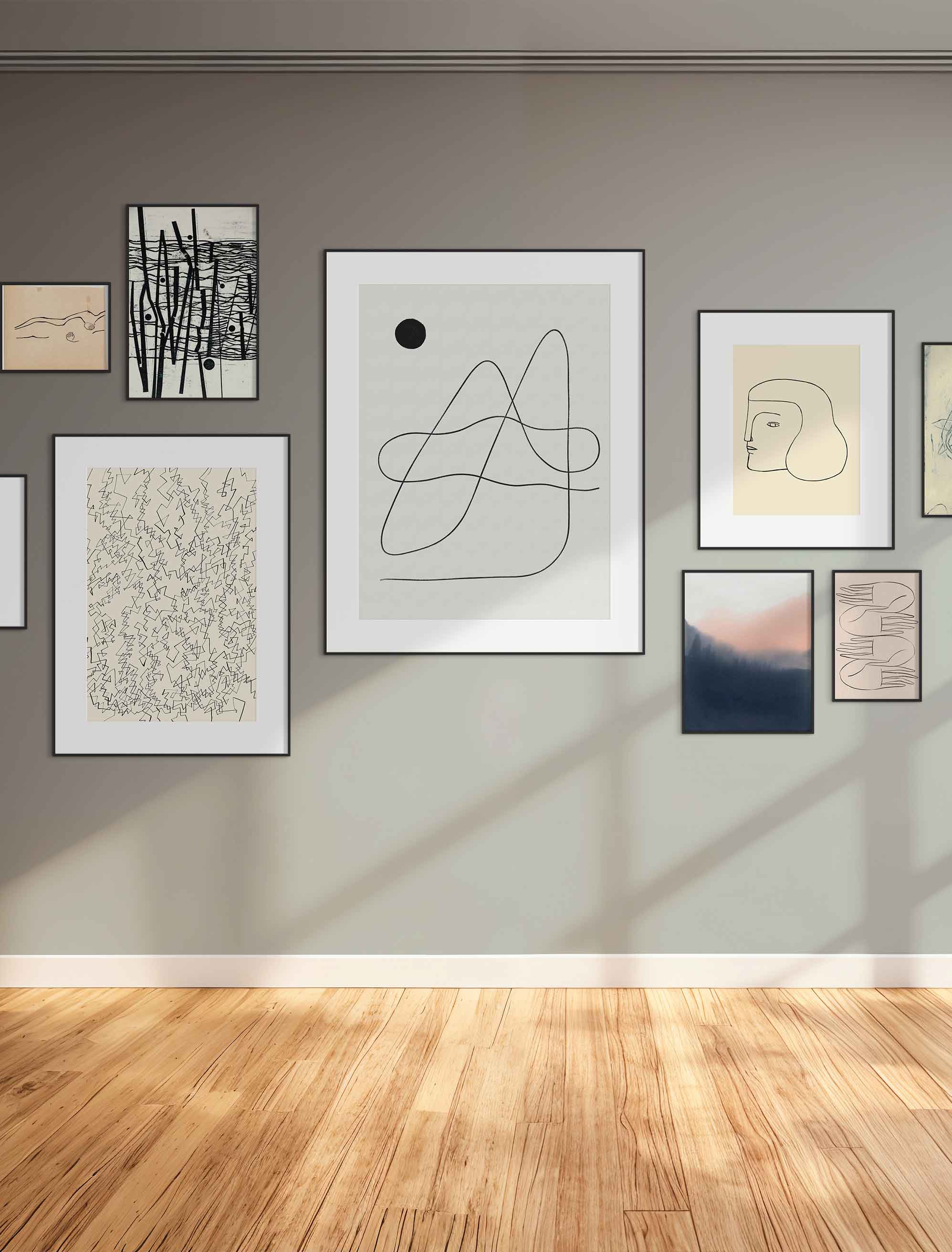
They’re also great in small groupings. A few pieces hung close together can create a conversation between different marks and styles, while still feeling cohesive because of the shared looseness.
Scribble Art by Room
Scribble art can work almost anywhere, but different styles suit different spaces.
Living Room
This is where you can go a bit bolder.
Larger abstract scribbles or expressive figure drawings hold up well from a distance and give the wall a focal point without feeling heavy.
Bedroom
Softer, simpler pieces tend to work best here.
A single line drawing or a quiet botanical sketch adds interest without pulling too much focus, which keeps the space calm.
Home Office
This is a natural fit for more energetic pieces.
A confident, gestural composition can add just enough movement and focus to keep the space feeling active without becoming distracting.
Hallway and Entry
In smaller or transitional spaces, a single strong piece is usually enough.
Scribble art works well here because it’s simple yet expressive, making an impression quickly without overwhelming the space.
Choosing the Right Scribble Art Print for Your Space
With scribble art, the difference between something that works and something that doesn’t is usually subtle, but once you see it, it’s clear.
Start by looking at how the piece reads from a distance. Even the loosest compositions should feel balanced and complete when you step back. If it only works up close, it may not hold the wall the way you want it to.
Next, think about the kind of energy you want in the room. Softer line drawings and freehand botanicals feel quieter and more personal, while bold, layered scribbles bring movement and a bit more presence.
Scale matters too. A small, delicate line drawing can get lost on a large wall, while a larger, more confident piece can anchor the space with very little else around it. If you’re building a gallery wall, look for prints with a similar tone or line quality. Even if the subjects differ, that shared mark-making keeps everything feeling connected.
Final Thoughts
Scribble art stands out because it brings something back that’s been missing for a while, a sense of the hand behind the work.
It’s not about perfection or polish. It’s about presence. A line that moves slightly, a composition that still shows how it came together, that’s what gives these pieces their energy.
In a home, that translates into something that feels more personal and less staged. Even a single piece can shift the tone of a room, making it feel more relaxed, more lived-in, and a little more interesting over time.
FAQs
What Is Scribble Art?
Scribble art refers to drawings and compositions made with loose, freehand lines. It often includes gestural sketches, abstract marks, and minimal line drawings that show the artist’s process.
Is Scribble Art a Current Trend in Interior Design?
Yes, it’s become increasingly popular as part of a broader shift toward more human, imperfect, and process-driven art styles.
How Do I Frame Scribble Art Prints?
Simple frames work best. Clean lines and minimal detail help the artwork stand out without competing with it. A mat can also give the piece more space to breathe.
Does Scribble Art Work in a Minimal Interior?
Yes. In fact, it works especially well in minimal spaces because the line's simplicity adds interest without clutter.
How Do I Tell the Difference Between Good and Poor Quality Scribble Art?
Look at how the piece feels from a distance. Strong scribble art feels balanced and intentional, even if the marks are loose. If it feels unresolved or uneven overall, it may not hold up as well on a wall.
Art included:
Number 24 by Carolyn Reed Barritt
Place Within Reach 22. by Petr Strnad
Head by Nadiuska and Priscila Furtado - Universo
Moon Landscape by Roseanne Kenny
Rebel Thoughts N.2 by Catalina Somolinos
Mountains by Rikkianne Van Kirk
Published on: April 16, 2026 Modified on: April 19, 2026 By: Artfully Walls
Previous: Lemon Trees and Sea Breezes: Why Mediterranean Wall Art Is the Ultimate Mood Booster Next: Calming Bedroom Art for a Restful Room
