From Runway to Gallery Wall: When Fashion Becomes FArt
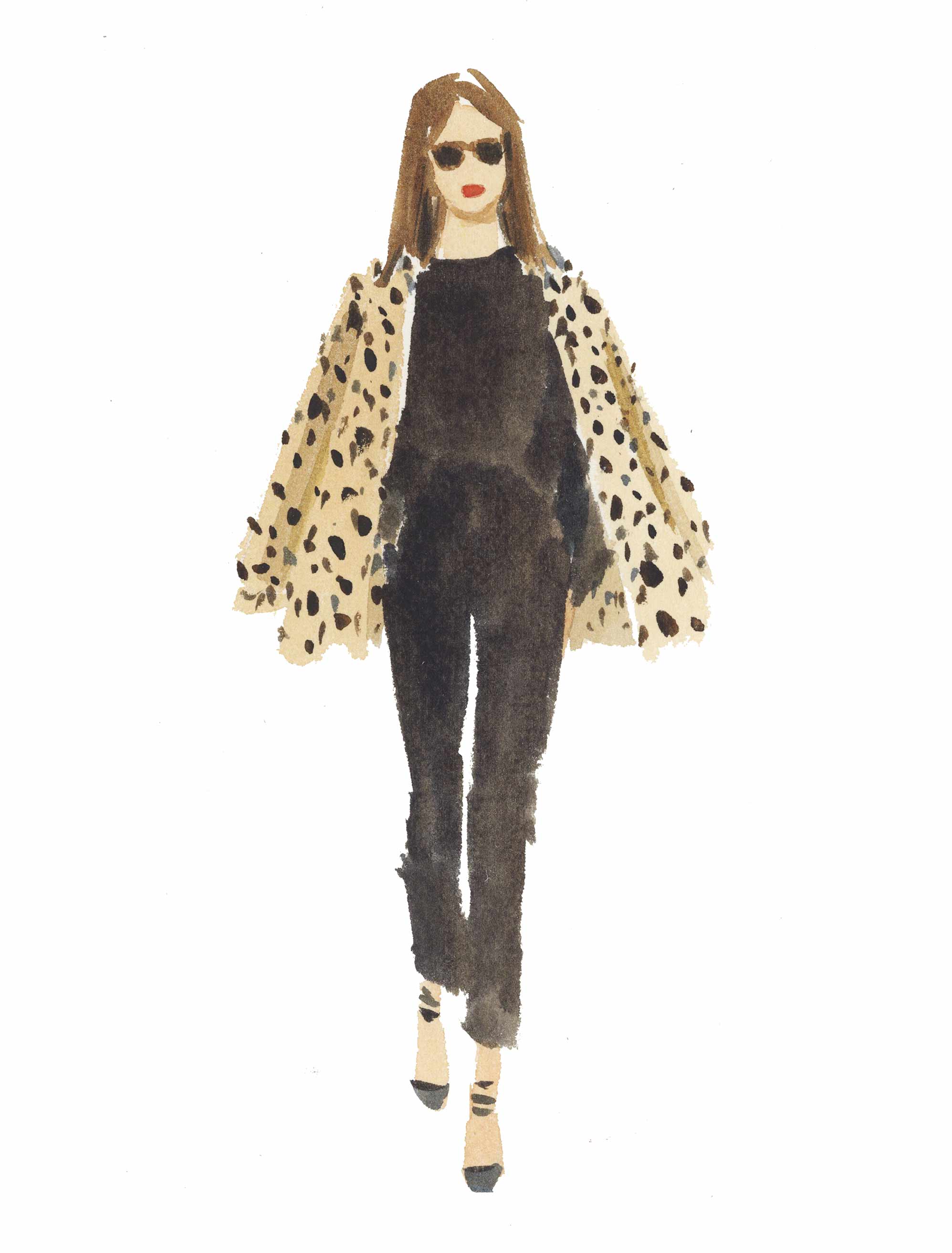
Fashion illustration Leopard and Black by Caitlin McGauley.
Fashion wall art has a particular kind of energy to it. There's movement in the lines, attitude in the poses, and a sense that the image is in the middle of saying something. A sweeping illustrated gown, a black-and-white editorial portrait, a graphic print pulled straight from runway culture: any of these can shift the mood of a room in an afternoon.
And really, fashion has always belonged on the wall. The line between fashion and fine art is thinner than people assume. Illustrators, photographers, and designers have been making images for a century that look just as right in a frame as on a magazine spread. What's changed is that we've stopped pretending personal style ends at the closet door. It carries into the rooms we live in, too.
Key Takeaways
- Fashion wall art covers vintage illustration, editorial photography, graphic typography, and contemporary fashion-inspired prints.
- The category has grown because more people want art that feels personal and confident rather than safely neutral.
- Bedrooms, dressing areas, hallways, home offices, and living rooms are the natural spots for fashion prints.
- Good fashion art has strong composition, color, and movement. It isn't just "about fashion."
- A fashion-themed gallery wall reads as curated and editorial without tipping into formal.
Why Fashion and Art Have Always Been Inseparable
Fashion and art share a vocabulary. A dress is line, shape, texture, and color. A runway shot can hold the weight of a painting. A quick ink sketch can capture attitude faster than a photograph ever could.
The golden age of fashion illustration made this obvious. Artists like René Gruau, Antonio Lopez, and Carl Erickson worked for magazines and couture houses, and their drawings carried real elegance, wit, and rhythm. They weren't documenting clothes. They were capturing posture, mood, the way a woman tilted her head.
Fashion photography travelled a similar road. In the hands of Richard Avedon, Helmut Newton, or Guy Bourdin, the dressed figure became something graphic and almost cinematic. These photographers shaped how fashion came to be read, not as product, but as culture.
That history is why fashion wall art lands so naturally in a home. It pulls from one of the richest visual languages we have. Chosen well, it doesn't feel like themed decor. It feels like a person showed up in the room.
The Styles Within Fashion Wall Art
Fashion wall art isn't one look. It can be quiet, bold, nostalgic, glamorous, or wickedly graphic. What ties it together is a love of style and form.
Vintage Fashion Illustration
Vintage fashion illustration holds up beautifully. Long lines, elegant gowns, sweeping silhouettes, a touch of pose. There's romance to the style, but it stops well short of saccharine.
These prints settle in nicely in bedrooms, dressing rooms, powder rooms, and softer living spaces. Pair them with clean framing and a calm wall color, and they read like something pulled from a vintage Vogue archive.
Editorial and Graphic Fashion Photography
Photography brings a different temperature. It can be crisp, moody, sharp, glamorous. Black-and-white prints feel timeless. Color photography pushes the energy higher and more contemporary.
A strong fashion photograph above a console or in a hallway gives a space a real point of view. It works particularly well in interiors that lean design-forward.
Fashion Typography and Graphic Prints
Some fashion-inspired prints skip the figure entirely. They borrow the language of magazine covers, runway signage, and luxury branding: typography, bold blocks of color, clean shapes.
These pieces are playful and modern, and they're useful when you want fashion energy in a space without anything too literal. Home offices and dressing areas suit them especially well.
Contemporary Fashion Illustration
Contemporary fashion illustration has a freer, looser feel. There's confidence in the line, but the palette is more modern and the subject matter more varied. A single gesture, a hint of fabric, a stylish shoulder.
These prints play nicely with abstracts, florals, or photography in a gallery wall. They bring movement without overcrowding the room.
How to Style Fashion Wall Art in Your Home
Fashion prints have personality, so the styling job is mostly about giving that personality room to breathe. You don't need the whole interior to read like a showroom. One stylish note in a relaxed space is often the strongest move.
Keep the framing simple. Slim black, white, brass, or natural wood frames hand the attention back to the artwork. Bold print, clean frame. Softer print, slightly warmer frame.
Plain walls work especially well. White, cream, soft gray, blush, and warm beige all let silhouette and composition come forward. Heavy wallpaper or busy patterns can muddy the read of a fashion print.
Think about the room's existing voice, too. Fashion art looks best in interiors that already have a sense of taste, whether that's minimal, eclectic, feminine, vintage, or maximalist. The print should slot in like it belongs, not arrive announcing itself.
Fashion Wall Art by Room
Almost any room can carry fashion prints, but the right piece depends on the space.
Bedroom and Dressing Room
These are the most natural homes for fashion wall art. They're already personal, already a little theatrical, already about how you present yourself to the world.
In the bedroom, a fashion print works above a dresser, near a vanity, or layered into a soft gallery wall. In a dressing room or walk-in wardrobe, it goes further still. A curated wall of prints turns a functional space into something closer to your own private editorial set.
Living Room
Living rooms reward considered choices. A single large print can anchor the room if the composition is strong and the silhouette clear.
Fashion prints also slip well into broader gallery walls. Mix illustration with photography, abstracts, typography, and small decorative pieces so the theme feels layered rather than literal. The aim is collected, not matched.
Hallway and Entry
Hallways suit one strong fashion print. They're transitional, so they can carry something with instant impact: a graphic shoe, a striking portrait, a clean typographic statement.
In an entryway, fashion art sets the tone for the rest of the home. Guests get a quick read on your style before they've even made it to the sofa.
Home Office
Fashion prints bring energy to a workspace without making it feel busy. Graphic prints, bold color, and clean compositions all work here.
A fashion-inspired piece above a desk or bookshelf reminds you that workspaces don't have to be purely functional. They can have charm, style, and a bit of spark.
Building a Fashion-Themed Gallery Wall
A fashion-themed gallery wall is one of the best ways to use this kind of art. It creates that curated, editorial feeling the subject lends itself to. The trick is making the wall feel connected without making every piece a near-copy of the next.
Start with a thread. That could be a color palette (black, cream, blush, and red). It could be a style, like vintage illustration or bold photography. Or it could be a mood: Parisian, playful, minimal, glamorous.
Mix the scale. Use one or two anchor pieces, then build around them with smaller prints. The variation keeps the eye moving across the wall.
Frames matter. Match them for a polished look, or coordinate finishes for something more relaxed. Black, white, brass, and natural wood all pair well with fashion prints.
Lay everything out on the floor before you hang. 2 to 3 inches between frames is a good baseline, and the center of the arrangement should sit roughly 57 to 60 inches from the floor. A little planning makes a real difference.
What Makes Fashion Wall Art Worth Hanging
The best fashion wall art has more than a stylish subject. It has visual weight. The composition works. The colors are considered. The image rewards more than a glance.
Before buying a fashion print, look at it as art first, theme second. Does the shape of the figure hold your eye? Is the line interesting? Does the palette suit your room? Does it feel personal, or does it feel like wallpaper for a boutique?
A good piece brings something beyond its subject. Illustration can add grace. Photography can add contrast and edge. Graphic prints can bring rhythm and modernity. The right print should feel like part of your taste, not a vague nod to fashion as a topic.
That's where curation matters. The print should be specific enough to feel special and versatile enough to live with for years. It should look right today and still feel like you down the line.
Final Thoughts
Fashion wall art at its best isn't themed decoration. It's graphic art shaped by one of the most expressive visual languages in contemporary culture. Line, silhouette, movement, color, attitude, all wrapped into something you can hang in your living room.
The runway has always produced images worth keeping. So have fashion magazines, photography studios, sketchbooks, and graphic designers. Bringing that language home is a way of letting your style step beyond the wardrobe and into the walls around you.
If you want a room that feels more expressive, more polished, or a little more editorial, fashion-inspired prints are a lovely place to begin. Find pieces that match your taste, whether that's classic illustration, bold photography, sharp typography, or something softer you didn't expect to love.
FAQs
What is fashion wall art?
Fashion wall art is any artwork rooted in fashion: illustration, editorial photography, graphic prints, typography, or contemporary work inspired by the shapes and moods of runway culture.
Where is the best place to hang fashion prints in a home?
Bedrooms, dressing rooms, hallways, home offices, and living rooms all work well. Anywhere you want a touch of style and personality.
How do I build a fashion-themed gallery wall?
Pick a visual thread (a color palette, an illustration style, a fashion era, or a mood). Mix larger and smaller pieces, keep the spacing consistent, and use coordinated frames.
Does fashion wall art suit a minimal interior?
Yes. In a minimal interior, choose fashion prints with clean lines, restrained color, strong negative space, or simple black-and-white composition. This adds personality without overwhelming the calm of the room.
What frame style works best with fashion illustration prints?
Simple frames usually work best. Slim black, white, brass, or natural wood frames let the illustration stay the focus while giving the print a clean, finished look.
Art included: Leopard and Black by Caitlin McGauley
Published on: May 26, 2026 Modified on: June 19, 2026 By: Artfully Walls
Previous: The Tapestry Revival: Why Woven Art Is Having a Moment Next: How to Plan a Kitchen Gallery Wall
