Calming Bedroom Art for a Restful Room
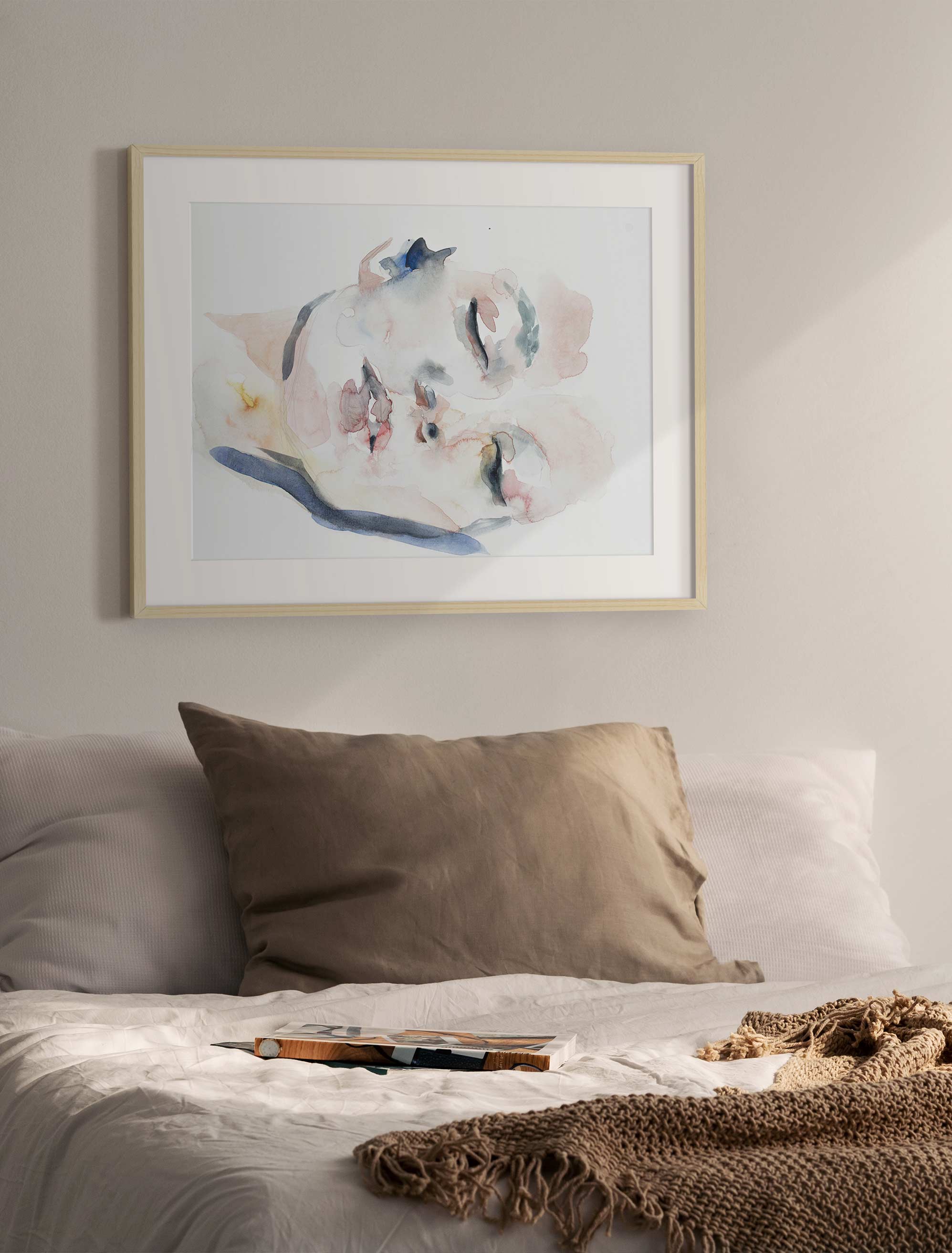
A single soft piece, well placed above the bed, is often all a room needs.
Calming bedroom art is less about filling a wall than setting a mood, the kind that lets a room breathe out at the end of a long day. The best pieces quiet a space instead of competing for your attention, and choosing one really comes down to five friendly decisions: color, subject, size, frame, and placement. Get those working together, and a bedroom feels softer the moment you walk in.
Calming bedroom art uses soft colors, gentle subject matter, balanced scale, and simple framing to help a bedroom feel restful. Good choices include abstracts with quiet movement, nature scenes, botanicals, watercolor prints, and neutral photography, placed where they settle the eye rather than pull it in every direction.
None of it needs to be complicated. Once you can picture what a calming piece actually looks like, the choosing gets a lot easier, and you can wander through the bedroom art collection knowing exactly what you're after instead of scrolling in circles.
Key Takeaways
- Calming bedroom art depends on color, subject, scale, frame, and placement working together, not on any single style label.
- Soft abstracts, botanicals, nature scenes, watercolor prints, and neutral photography all suit a restful room.
- Low contrast usually reads quieter than high contrast in a bedroom.
- The two-thirds rule gives above-bed art a balanced starting width.
- Large bedroom art can still feel restful when the palette is quiet, and the composition has room to breathe.
- A bedroom gallery wall can feel calm when the spacing, frame color, and palette stay consistent.
What Makes Bedroom Art Feel Calming?
Bedroom art feels calming when it lowers the visual tension in a room rather than adding to it. Calm is less about one "right" style and more about the overall effect: soft contrast, breathing room, familiar shapes, and colors that echo what's already around you.
Think about how your eye travels across a piece. Slow, drifting movement feels restful, the visual equivalent of a deep breath. Sharp edges, busy detail, and hard contrast ask your eye to work, which is the last thing you want in a room built for winding down. A calming piece simply gives you somewhere soft to look when the day is done.
That's why the same guidelines that make any room feel pulled together matter even more here. Softness, space, and a quiet palette do most of the work, long before you settle on a specific subject.
Best Colors for Calming Bedroom Art
The best colors for calming bedroom art are the ones that lower contrast and echo the tones already in your room. Cool shades tend to feel airy and quiet, while warm neutrals feel grounded and soft, and both can work beautifully depending on the mood you want.
For a light, breathable feeling, look to soft blues, muted greens, and pale gray-greens. These recede gently, making a room feel more open. For something warmer and more enveloping, earthy brown tones, clay, blush, cream, and sand bring a cozier, settled quality without going dark.
One helpful idea for beginners: pay attention to undertones. A cool room with gray or blue undertones usually likes cool-leaning art, while a warm room with beige or wood tones likes warmer pieces. When the undertones agree, the art feels like it belongs. And keep contrast gentle. Save bold, high-contrast pieces for busier rooms, and let the bedroom stay soft.
Calming Bedroom Art Ideas by Style and Subject
Certain styles and subjects lend themselves to calm because their edges and rhythm feel gentle. Abstracts, nature, botanicals, watercolor, and soft photography are the reliable starting points, each with a slightly different mood.
Abstract art can feel wonderfully calm when the movement is slow and the contrast is soft. Look for flowing shapes and blended color rather than sharp, graphic energy. Nature scenes bring familiar, restful forms into the room, quiet horizons, still water, soft light, that are easy to look at. Botanical prints do something similar with leaves, branches, and blooms, adding life without noise.
Medium matters too. Watercolor prints suit bedrooms especially well, because the soft, bleeding edges feel gentle by nature. Soft, neutral photography works when the palette stays muted, and the scene feels still. If you love black-and-white, keep the contrast low and the subject calm, so it reads as quiet rather than graphic.
How to Choose the Right Size for Bedroom Wall Art
The right size for bedroom art is the one that feels anchored to the wall and furniture around it, not just a number on a tape measure. Scale is really a comfort choice, and a well-sized piece makes a room feel settled rather than sparse or crowded.
Large art can feel peaceful, not overwhelming, as long as the palette is quiet and the composition has open space. A big, soft piece often calms a room more than several small ones scattered about. If you'd rather not go with a single large-scale print, a matched pair over two nightstands brings a gentle symmetry that reads as calm in itself.
Above a headboard, the two-thirds rule is your friend: aim for art that spans about two-thirds of the width of the bed or headboard below it. That single guideline solves most above-bed sizing questions.
Here's how it plays out. Say you have a queen bed with a headboard about 60 inches wide. Art or a grouping around 40 inches wide is a strong starting point, wide enough to feel connected to the bed, not so wide that it crowds the wall. Leave a comfortable gap between the top of the headboard and the bottom of the frame so the wall can breathe, and adjust for your ceiling height and how visually heavy the piece feels. Treat it as guidance, not a hard rule.
A Simple Checklist for Choosing Calming Bedroom Art
This checklist helps you choose with confidence before you buy. Run through it, and most of the second-guessing falls away.
- Does the art repeat at least one tone already in the room, from the bedding, rug, or walls?
- Does the subject feel settled and quiet rather than loud or tense?
- Is the scale right for the wall and the furniture beneath it?
- Have you pictured the frame color against your bed frame, lamps, and hardware?
- Will the spot you have in mind let the piece breathe, with a little open wall around it?
- Does the room's lighting flatter the colors, both by day and by lamplight?
If you want to go deeper into any of these, there's plenty more to choose from when it comes to choosing the right wall art for a room. Mostly, though, trust the answers that feel true for your space.
Where to Place Art in a Restful Bedroom
Art in a restful bedroom belongs where it can be seen easily without crowding the room or the people in it. Placement shapes the calm as much as the piece itself, so it's worth a moment's thought before you reach for a hammer.
Above the bed is the classic spot. Keep the piece anchored and centered over the headboard, with a safe, comfortable gap above it so nothing feels like it's looming. The wall opposite the bed deserves special care, since it's often the first thing you see in the morning, so keep whatever hangs there especially quiet. Bedside pieces and small works over a dresser round things out at a more intimate scale.
If you love the collected look, bedroom gallery walls can absolutely feel restful. The trick is restraint: consistent spacing, a shared frame finish, and a palette that stays soft. Avoid stacking several high-contrast pieces in one view, and the whole arrangement will still read as calm.
How to Keep Calming Art From Feeling Bland
Calming art keeps its personality when one quiet detail is allowed to stand out. Restful does not have to mean beige, blank, or forgettable, and the best calm rooms still have something to look at.
The move is simple: keep the overall palette soft, then let a single element carry a little energy. That might be textured brushwork, a slightly warmer accent tone, an unusual crop, or a subject that means something to you. Because a bedroom is private, personal connection matters more here than in any other room, so choose something you genuinely like looking at.
A great example is a soft abstract print with gentle movement and one deeper tone running through it. It stays restful, but it has enough character for the wall never to feel empty or generic.
How to Shop for Calming Bedroom Art
The easiest way to shop for calming bedroom art is to start with the room, then narrow by the details you've settled on. Begin with the bedroom collection, then filter by color, size, style, and orientation until the options match your room's softest tones.
Look for prints that repeat a color you already live with, and lean toward quiet subjects and simple frames. If you're choosing several pieces at once, curated gallery walls take the guesswork out of spacing and mix. With hand-picked prints across a wide range of prices, it's easy to find something that feels personal without feeling like a gamble.
FAQs
What kind of art is best for a bedroom?
The best bedroom art is personal, visually quiet, and scaled to the wall. Soft abstracts, botanicals, nature scenes, watercolor prints, and neutral photography are strong choices when the colors support the room's restful mood.
What is the most calming art for a bedroom?
The most calming bedroom art usually has soft colors, gentle movement, and familiar subject matter. Nature scenes, simple abstracts, botanicals, and muted watercolor prints tend to work well because they give the eye a quiet place to land.
How can I make my bedroom calmer with art?
Choose art that repeats one or two tones from your bedding, rug, or wall color. Keep the contrast low, use simple frames, and place larger pieces where they feel anchored rather than crowded.
What is the 2/3 rule for bedroom wall art?
The two-thirds rule suggests that art above a bed should be about two-thirds the width of the headboard or furniture below it. It's a starting point that helps the piece feel balanced and connected to the bed.
Should bedroom art match the bedding?
Bedroom art doesn't need to match your bedding exactly. It's better to share a mood or undertone with the room. A repeated color, a related neutral, or simply a softer contrast is usually enough to feel cohesive.
Can a gallery wall be calming in a bedroom?
Yes. A bedroom gallery wall can feel calm when the frames, spacing, palette, and subjects stay consistent. Keep the arrangement clean and avoid too many high-contrast pieces in a single view.
Art included:
Published on: July 23, 2026 Modified on: July 26, 2026 By: Artfully Walls
Previous: Back to School Kid Room Wall Art Ideas Next: Slow Living Art for Calm, Restful Homes
