7 Tips for Mixing Black-and-White and Color Photos on a Gallery Wall
Mixing black-and-white and colored photo art prints, makes a dramatic statement.
Mixing black-and-white and color art prints on the same gallery wall is one of the more rewarding things you can do with a blank wall. The tonal gap between monochrome and color creates a lovely visual tension, and with a few simple moves, that tension turns into a wall that feels layered, dynamic, and alive.
The good news is that you're working with curated artistic photography and fine art, not a shoebox of holiday snaps. When you can hand-pick each piece for its composition, tone, and subject, you've got far more control over the result. These seven tips are about using that control on purpose. And if you're wondering whether the look is worth the effort, gallery walls are everywhere right now, and the mixed-tone version is the one that stops people mid-scroll.
Key Takeaways
- A mixed black-and-white and color gallery wall works when there's a deliberate visual logic behind it. Quality of curation matters far more than how many prints you hang.
- A consistent tonal register across your color prints (similar saturation, brightness, and warmth) is the single biggest factor in keeping the wall feeling considered and easy on the eye.
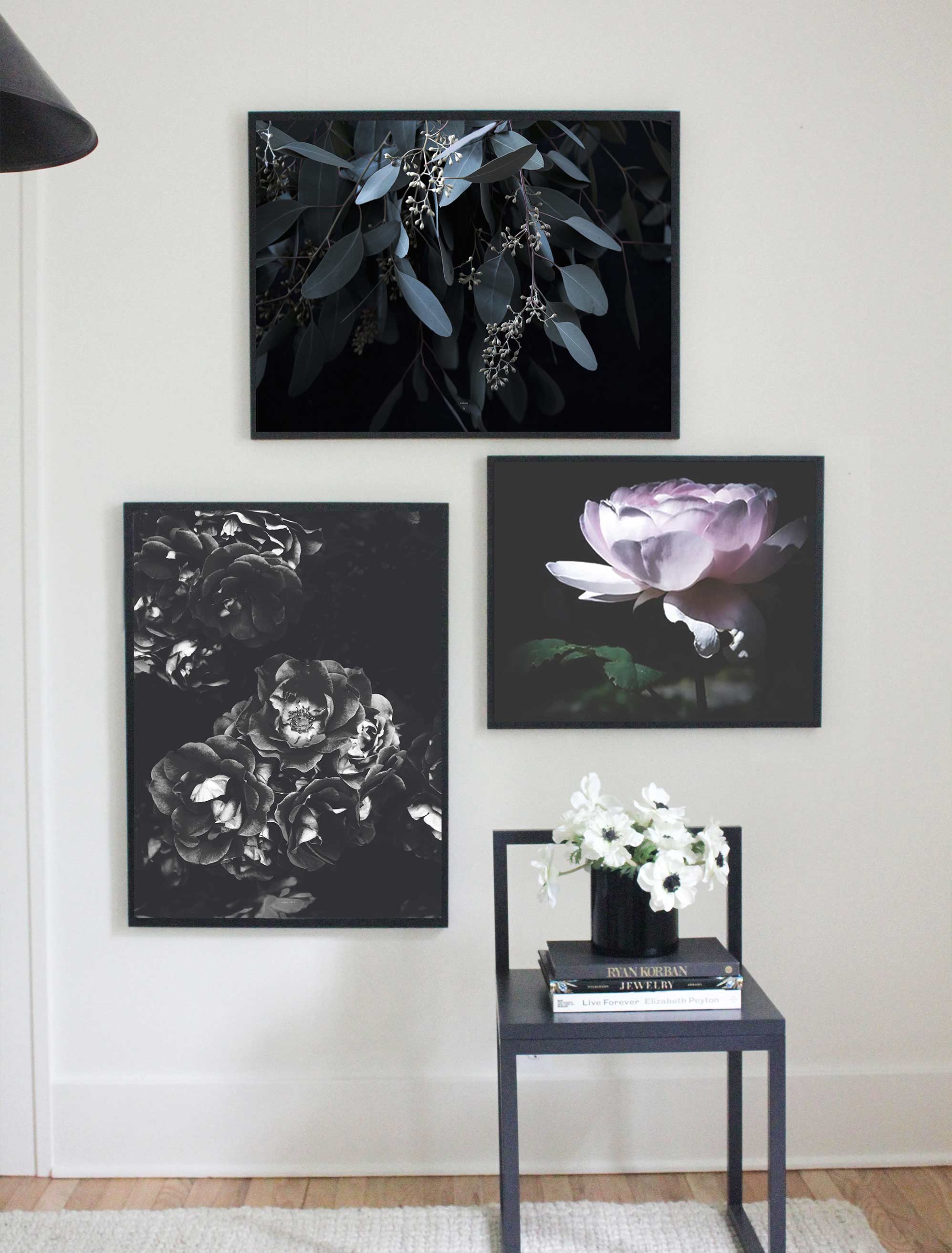
- Black-and-white prints act as anchors, giving the eye somewhere calm to rest and making your color prints read more vividly.
- One frame finish across everything is the most reliable way to unify the whole arrangement.
- Your ratio of black-and-white to color sets the mood: mostly monochrome reads quiet and formal, mostly color reads warm and energetic.
Why a Mixed Black-and-White and Color Gallery Wall Actually Works
Here's the thing about that tension between monochrome and color: it isn't a problem to smooth away, it's the whole point. A wall of only color can run a little high-energy, and a wall of only black-and-white can feel cooler and more formal. Put them together, and each one brings out the best in the other.
Black-and-white prints bring graphic clarity and a tonal calm that pure color often lacks. Color prints bring warmth and vitality that monochrome can't manage alone. Side by side, the black-and-white work makes the color read more vividly, and the color stops the monochrome from feeling chilly. And that magic really shows when you've chosen and placed both with a little intention.
A Few Things Worth Keeping in Mind
A handful of patterns can make a mixed wall feel a little less settled, and the lovely thing is they're all easy to nudge. Color prints pulling in very different directions of saturation can feel busy side by side. Grouping all the black-and-white in one spot and all the color in another can read as two walls rather than one.
Switching frame finishes between them adds an extra variable to track. And a near fifty-fifty split can feel less intentional than leaning one way or the other. None of these is a rule you've broken, just a small thing to be aware of, and each has a gentle fix in the tips below.
The 7 Tips for Mixing Black-and-White and Color Prints
Apply these as a set rather than cherry-picking the easy ones. They reinforce each other, and that's where the cohesive, considered result comes from.
Keep Your Color Prints in the Same Tonal Register
The thing that most often keeps a mixed wall from settling isn't the black-and-white at all; it's color prints pulling in lots of different directions at once. One neon-bright, one dusty and muted, one cool, and one warm can feel a little busy together.
The easy move is to pick color prints that share a tonal register: all richly saturated, or all soft and desaturated, so they read as a family. A gentle, hazy piece like Pastel Sunset by Henrike Schenk, with its muted Dutch-coast light, plays beautifully next to monochrome precisely because its color whispers rather than shouts.
Let Black-and-White Prints Be Your Anchors
In a well-built mixed wall, the black-and-white prints aren't filler; they're doing a job. They give the eye a place to rest between the busier color pieces, sharpen the color with contrast, and bring a quiet discipline that keeps the whole thing from tipping into overload.
A graphic, high-contrast piece like Abstract Landscape of Desert by Diana Putters, all sculptural dunes and deep shadow, is exactly the kind of anchor that steadies a colorful arrangement.
Pick One Frame Finish and Commit
Frame consistency is your most powerful unifying tool, full stop. One finish across every print, regardless of what's inside, creates a framework that holds wildly different subjects and tones together.
A single frame finish does more heavy lifting than almost anything else: thin black suits warm palettes with punchy monochrome, natural timber suits warm and earthy color, and white or off-white suits cooler, muted palettes.
A mixed-frame gallery wall can work in the right hands, but when you're already juggling color and black-and-white, one frame finish is the safer, calmer bet.
Let Subject Matter Tie It Together
If tone and frames are the visual scaffolding, the subject is the reason the collection exists at all. Pull all your prints from one broad family, whether that's landscapes, botanical studies, architectural shots, or abstract work, and the eye reads the wall as intentional, no matter how much the tones vary.
Or connect them through a shared compositional habit instead: strong horizon lines, lots of negative space, a single dominant subject in each frame. That repetition becomes a rhythm that carries across the color divide.
Decide Your Black-and-White-to-Color Ratio on Purpose
Ratio is a mood dial, so turn it deliberately. Mostly black-and-white with two or three color prints as accents gives you a quiet, formal, graphically considered wall. Flip it (mostly color with two or three monochrome anchors), and you get something warmer and more energetic.
Both look wonderful. The only thing to sidestep is an accidental fifty-fifty, which can read as split down the middle rather than leaning somewhere on purpose.
Weigh Each Print, Not Just Its Color
Visual weight isn't only about color versus monochrome. It's about size, compositional density, and how much is happening inside the frame. A big, bold piece in high-contrast black-and-white can easily out-muscle a small, softly colored print beside it.
A busy, detail-packed image carries more weight than one of the same size built around empty space. So judge each print on its own terms rather than assuming color always wins. That's how you keep the whole arrangement feeling nicely balanced.
Floor-Test Before You Hang
The single most reliable trick: lay everything out on the floor in the planned layout, with the real spacing, before a single nail goes in. Step back to roughly the distance you'll actually view it from, and look honestly at whether the tonal balance, rhythm, and weight feel deliberate or just busy.
It's far easier to swap a print on the floor than to patch a wall later, and our guide to lay everything out on the floor first walks through the whole process.
Two Last Things Before You Hang
With the seven tips in play, there are just two small things worth a thought. The first is mixing print mediums: Glossy photographs sit a little differently next to matte digital illustrations, so it's worth a quick check that your surfaces feel like they belong together (this is the part of a mixed media gallery wall that rewards a second look).
The second is hanging height. It's easy to overlook on any gallery wall, and here it matters a touch more, since floating the arrangement well above the furniture can loosen the grounded feeling that makes a mixed wall sit so nicely.
Keeping it hung at the right height and anchored to what's below helps it feel settled. Even spacing is a lovely finishing touch, too: tidy, consistent gaps quietly show that all that tonal variety was your plan all along.
Building Your Black-and-White Photo Wall: Where to Start
Start with selection, not arrangement. Begin with one strong black-and-white anchor, something like Black and White Architecture, Amsterdam by Dohi Media, with its high-contrast lines and moody sky, because that piece sets the register against which everything else gets measured. Choose your color prints next, keeping them in a shared tonal register and linking them to the anchor through subject, composition, or mood. Then, before you commit to a layout, confirm the pieces come in the sizes your wall needs, since a print that sings at large scale can lose its impact shrunk down.
To tie the whole thing together before anything touches the wall, the Artfully Walls Wall Designer tool lets you arrange your chosen prints and frames on a mock-up of your own room. You can shuffle the layout, swap pieces in and out, and see exactly how your mix of black-and-white and color comes together, all before you pick up a hammer.
Final Thoughts
Mixing black-and-white and color on a gallery wall is one of the more satisfying things you can do at home, as long as you give a little thought to tonal register, frames, subject, balance, and ratio.
Get those right, and you end up with something more layered, more dynamic, and frankly more you than a wall of all-monochrome or all-color could ever be.
Whenever you're ready to start choosing, browse monochrome and color photography, as well as the wider range of fine art prints, and pull together a wall that's entirely your own.
FAQs
Can you mix black-and-white and color photos on a gallery wall?
Absolutely, and it often looks better than sticking to one or the other. The trick is intention: keep your color prints in a consistent tonal register, use the black-and-white pieces as anchors, and tie everything together with a single frame finish.
How do you make a mixed gallery wall look cohesive?
Lean on consistency where it counts: one frame finish, a shared subject or compositional thread, color prints that match each other in saturation, and even spacing throughout. Those quiet repetitions tell the eye the variety is deliberate.
What frame finish works best for a mixed black-and-white and color gallery wall?
Whichever one you use on everything. Thin black suits warm, high-contrast arrangements, natural timber suits earthy palettes, and white or off-white suits cooler ones. The key isn't the color, it's committing to a single finish.
How many prints should a gallery wall have?
There's no magic number, and curation beats quantity every time. Plenty of beautiful walls use five to seven well-chosen pieces. Focus on how they work together, and the right count tends to reveal itself.
Should all gallery wall prints be the same size?
Not at all. Varied sizes usually make a wall more interesting, as long as you balance the visual weight across the arrangement. Just remember that a big, high-contrast print pulls more focus than a small, soft one, and plan your layout around that.
Art included: Queen of Sweden by Michele Frechette, August 2013 by Hilde Mork, Miss Jade by Hilde Mork
Published on: June 19, 2026 Modified on: June 24, 2026 By: Artfully Walls
Previous: Back to School: How Scholarly Prep and Sporty Ease Are Shaping Wall Art Next: Soft Surrealism in Wall Art: The Dreamy Trend Defining 2026
