Soft Surrealism in Wall Art: The Dreamy Trend Defining 2026
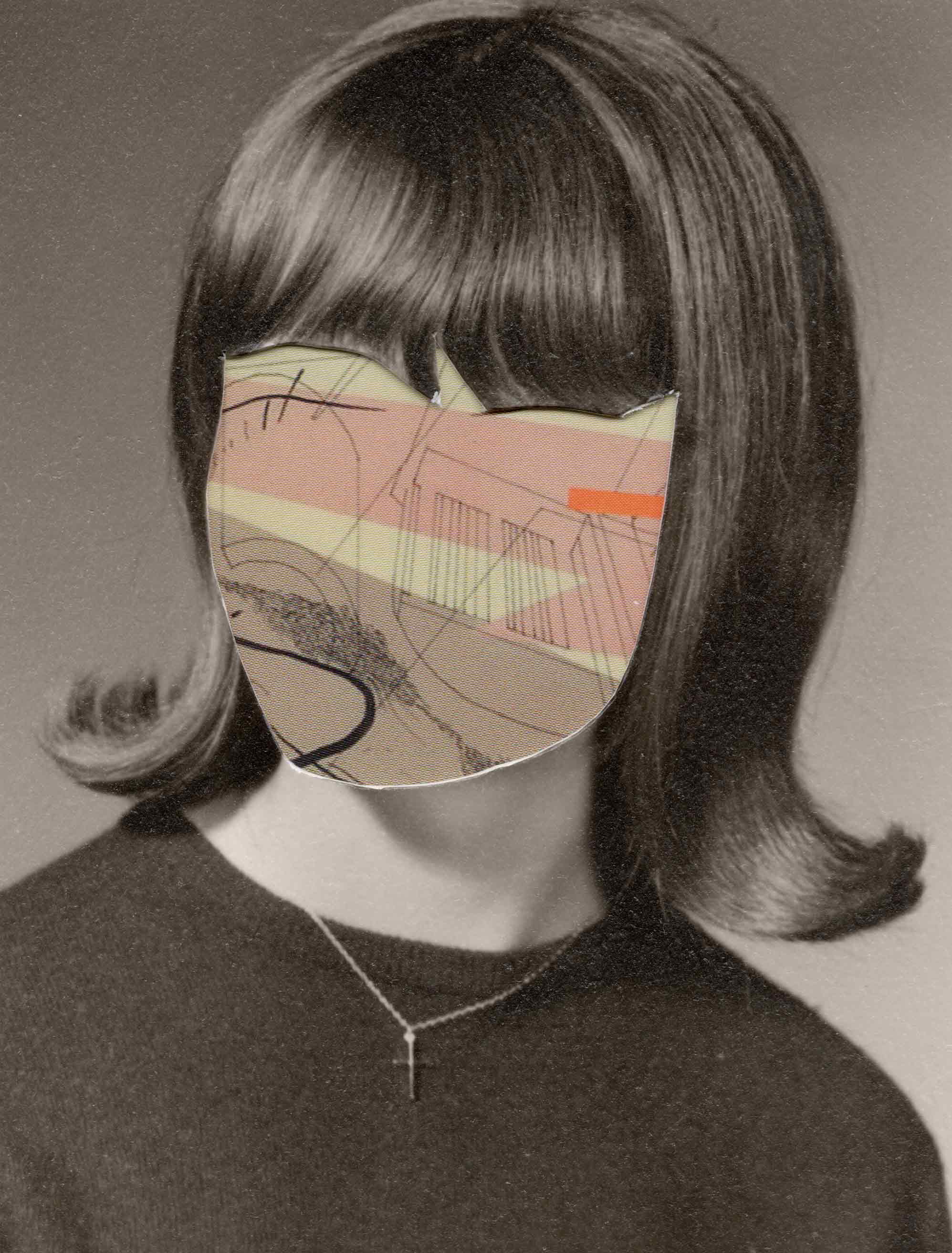
Revision 11 by Emily Hoerdemann
Some art you understand in a glance. Soft surrealism isn't that, and that's exactly the point. It's the look that's quietly defined the most interesting interiors of 2026: dreamlike imagery that's strange without being unsettling, figurative without being literal, and somehow emotionally familiar even when you can't quite say why. You catch yourself looking at it a beat longer than you meant to.
It borrows the dream logic of classic surrealist art, the floating objects and impossible scenes, but softens the edges. Where the twentieth-century surrealists wanted to jolt you, soft surrealism would rather draw you in. The palette is muted, the mood is contemplative, and the whole thing rewards a slow, second, third look rather than handing you everything at once.
Key Takeaways
- Soft surrealism pairs the dream logic and unexpected juxtapositions of surrealism with a muted palette and a calm, contemplative mood, which is what makes it so livable at home.
- It answers a real craving for spaces with depth and a little mystery, a gentle counterpoint to the instant, scroll-past legibility of digital life.
- Its tonal restraint means it slips into almost any interior, from minimal to maximalist, holding a wall without bullying the rest of the room.
- The best pieces balance strange imagery with a settled, resolved composition, so they grow on you rather than keep you on edge.
- Scale matters: the layered detail rewards a larger format, which makes soft surrealism a natural fit for statement positions.
What Soft Surrealism Actually Is
Soft surrealism isn't a formal movement with a manifesto and a founding date. It's a descriptive term that's bubbled up to name a particular feeling in contemporary art, one that sits apart from both the harder-edged surrealism of the history books and the looser bucket of "dreamy abstract" it often gets lumped in with.
In practice, a few qualities give it away. It uses recognizable things, natural forms, figures, architectural fragments, and everyday objects, but places them in scales, combinations, or settings that simply couldn't happen. The color leans muted, dusty, and atmospheric rather than saturated and psychedelic. The composition stays calm and resolved even when the subject is odd, so you can look at it for a long time without that prickle of visual anxiety that the more aggressive surrealists were going for. And the emotional register is contemplative, a little melancholic, quietly wondering, never jarring.
Why Soft Surrealism Took Over 2026 Interiors
A few cultural currents converged here. There's the steady move toward interiors with genuine psychological depth, not just a pretty surface, which has nudged people away from purely decorative art and toward work that actually gives you something to think about. There's the wider fascination with dreams, the subconscious, and inner states that's been shaping film, music, and fiction lately, and finds its natural home in images that run on dream logic rather than realism.
And then there's the screen of it all. We're trained by digital culture to read an image in half a second and move on. Soft surrealism gently refuses that. Its layered, open-ended, slightly ambiguous quality is the opposite of instant, and after years of infinite scroll, a wall that asks you to slow down feels like a small luxury.
There's also a comfort in it. Unlike the spikier surrealism of the past, which often set out to provoke, this version is happy to simply keep you company, offering a little wonder on an ordinary Tuesday rather than a confrontation. That blend of depth and ease is a big part of why it's everywhere this year.
What Soft Surrealism Looks Like in Practice
It's a range of approaches rather than one signature style, but once you've seen a few, you start spotting it everywhere. Take Protea by Anna Shabalova, a soft watercolor-and-ink piece where a bird and blooming flowers melt into a single, impossible, rather beautiful new species. It's recognizable and strange at once, which is the whole game. Here are the three main flavors.
Figurative Dreamscapes
These drop the human form, often partial or fragmented, into environments that don't obey the usual physics. Watch for scale relationships that ignore perspective, clouds, or water or flora appearing where they couldn't possibly be, and for a strong sense of psychological interiority, as if the figure is moving through a feeling rather than a place.
That inwardness is what gives the work its quiet pull, and it's why these pieces sit so differently from straightforward dreamlike landscapes.
Still Life With a Twist
Soft surrealist still life takes that classic arrangement of objects and slips in one element that doesn't logically belong, so a quiet strangeness creeps up on you. The best examples introduce it with real restraint, so the oddness is discovered rather than announced, more small delight than visual gag.
Something like Apple by Anna Shabalova reimagines a single, everyday piece of fruit as gentle, intellectual surrealism, the kind of still life that reads as calm until you really look.
Impossible Architecture
A whole strand plays with space itself: rooms, doorways, and corridors arranged in configurations that can't exist, or holding things that don't belong. There's a lovely logic to this one at home, because a picture of an impossible interior space, hung inside a real interior, makes the wall feel as if it's quietly opening onto another world with its own rules. It's especially effective in rooms where the architecture is already part of the character.
How to Bring Soft Surrealism Into Your Home
The usual placement and curation instincts apply, with a couple of tweaks specific to dreamy, layered imagery.
Placement and Scale
Soft surrealism works best as a single, considered statement rather than one tile in a busy gallery wall, because the layered meaning needs room to breathe and the focus a standalone spot provides. Scale really matters too. Most of these pieces carry a lot of quiet detail, so a larger format lets you actually read the imagery from where you'll naturally stand. Shrink a complex dreamscape down too far, and the magic just disappears.
Working With Your Room's Palette
That muted, dusty palette is wonderfully easy to place, because it doesn't carry the chromatic insistence of a highly saturated print. Soft surrealist work tends to glow in warm neutral rooms, where its faded, earthy tones feel of a piece with the surroundings rather than fighting them.
It's just as happy in a minimal, pared-back room, where it becomes the main event, and it can hold its own in a maximalist, layered space without adding to the noise.
Framing Soft Surrealism
Framing should support the mood, not override it. A simple timber or white frame with a generous mount gives the imagery breathing room and keeps things soft, where a heavy black frame can impose a graphic crispness that the work is actively resisting.
It's also worth considering museum or anti-reflective glass here, since the tonal subtlety is best enjoyed without a layer of surface glare getting in the way.
Soft Surrealism vs. Abstract Art
If you're torn between soft surrealism and pure abstract art, it really comes down to the kind of relationship you want with the piece.
Abstract work offers a direct, sensory hit of color, form, and texture, with no subject or story to decode, and that immediacy is exactly its appeal. Soft surrealism gives you a thread to follow instead: those recognizable elements, however strangely arranged, hand you a loose narrative.
And because the thread never quite resolves into one fixed meaning, the work keeps giving on the tenth viewing in a way a purely formal piece sometimes doesn't. Neither is better; it's just a question of temperament, and both earn their place on a wall.
Final Thoughts
Soft surrealism has defined 2026 because it offers something most decorative art doesn't: real depth of engagement, the kind that rewards a second look, shifts a little each time, and leaves a room feeling psychologically rich rather than simply nice. It's a response to a quiet hunger for interiors that hold a bit of mystery, not just beauty.
The pieces that work best at home are the ones that balance their strangeness with a tonal and compositional calm, so they settle in over the months rather than demanding to be solved. If that's the kind of slow magic you're after, it's worth spending some time with surrealism art prints and finding the one that keeps pulling your eye back.
FAQs
What is soft surrealism in art?
It's a contemporary take on surrealism that retains the dream logic and impossible juxtapositions while softening everything else: muted colors, calm compositions, and a contemplative mood. The result is strange but soothing, made to live with rather than to shock.
How is soft surrealism different from abstract art?
Abstract art is about color, form, and texture with no subject to read. Soft surrealism retains recognizable imagery, just arranged in impossible ways, so you still have a loose narrative thread to follow. It's the difference between a pure sensory experience and an open-ended little story.
What size print works best for soft surrealist wall art?
Go larger than you think. These pieces carry layered detail and meaning that you can read comfortably from across the room, and their generous scale also suits their natural role as a standalone statement rather than as one small piece in a crowd.
Which rooms suit soft surrealist wall art best?
Almost any, thanks to that gentle palette. It's especially lovely in warm neutral rooms, where the earthy tones feel right at home, and in minimal spaces, where it becomes the focal point. Bedrooms, studies, and reading corners all suit its quiet, introspective mood.
How do I frame a soft surrealist print?
Keep it soft. A simple timber or white frame with a wide mount gives the image space and protects its dreamy quality, while a heavy black frame tends to fight it. Anti-reflective glass is a nice upgrade if you want the tonal subtlety to really sing.
Art included: Revision 01 by Emily Hoerdemann
Published on: June 25, 2026 Modified on: June 25, 2026 By: Artfully Walls
Previous: Mixing Art Styles Like a Pro
