Why Metallic Art Prints Are Trending in 2026
Metallic art prints aren't about shine and flash, but can add mooe and sophistication.
You’ve probably noticed metallic tones showing up more often lately. In a friend’s living room, in a hotel lobby, or halfway through your social feed when you were supposed to check one thing and somehow kept scrolling.
Metallic art stands out because it does something most prints don’t. It catches light. It shifts subtly as the day goes on. Sometimes it glows softly, sometimes it adds contrast and depth without feeling shiny or flashy.
Unlike older, ultra-glam interpretations of metallic décor, today’s metallic art feels easier to live with. It’s more about tone, texture, and light than sparkle. That balance of visual interest and everyday usability is what’s pushing metallic art into the spotlight in 2026.
Key Takeaways
- Metallic tones are becoming a defining visual trend in 2026 interiors
- Subtle metallic finishes add depth and movement without overpowering a space
- Metallic colors like gold, copper, silver, and champagne work across many design styles
- These prints photograph beautifully and adapt well to changing light
- Metallic art feels elevated while remaining practical for real homes
What Metallic Art Prints Actually Are
Metallic art prints aren’t about heavy shine or mirror-like finishes. They’re about using metallic tones and finishes to introduce light, warmth, and dimension into an artwork.
Rather than relying on flat color alone, metallic elements interact gently with light. Depending on the angle and time of day, the artwork may appear warmer, cooler, brighter, or more muted. That subtle variation is what gives metallic prints their depth.
In most cases, metallic art relies on carefully chosen metallic inks, layered tones, or reflective pigments integrated into the artwork itself. The effect is refined rather than flashy, adding visual interest without dominating the room.
Why Metallic Art Feels So Right For This Moment
Metallic prints didn’t come out of nowhere. They’re showing up now because people are using their homes differently, and how much more personal those spaces have become.
A Softer Take On Luxury
Luxury looks a little different now. It’s less about being loud and more about small details that feel intentional, like a soft shimmer catching the light in an otherwise simple room.
They offer a hint of opulence, but in a way that blends easily with everyday living. You can pair a metallic piece with simple furniture and neutral tones, and it still feels elevated, not overdone.
Designed For A Visual Culture
Art today doesn’t just live on walls; it lives in photos. Metallic prints naturally catch and reflect light, which makes them especially striking in images.
That subtle glow or shimmer adds depth to room shots, making interiors feel richer and more dimensional. As more people discover décor through visual platforms, artwork that performs well visually tends to rise quickly.
Surprisingly Versatile
One reason metallic prints are spreading so easily across different homes is their adaptability.
They can warm up a minimalist space, add polish to a maximalist room, anchor an eclectic interior, or update a traditional setting without overpowering it. Few finishes move as fluidly between styles as metallics do.
Art That Changes With The Light
Unlike flat prints, metallic art doesn’t look the same all day. Morning light might make it glow softly. Evening lighting can bring out sharper highlights and deeper contrast.
It’s the kind of art that doesn’t quite look the same twice. You might notice it glowing in the morning, then picking up sharper highlights at night. That change is part of the appeal.
The Different Faces Of Metallic Art
Not all metallic prints look or feel the same. The finish you choose can subtly change the mood of a piece.
Gold and Champagne Tones
Gold doesn’t have to feel bold or traditional. Softer golds and champagne tones feel warm, timeless, and easy to style.
They work beautifully in neutral interiors, layered palettes, and spaces that lean warm or organic.
Silver And Cooler Metallics
Silver and platinum finishes bring a cooler, cleaner feel. They tend to feel more contemporary and pair beautifully with black-and-white artwork, architectural subjects, and modern abstract designs.
These finishes work especially well in spaces with cooler palettes or streamlined furnishings.
Copper and Warm Metallics
Copper and bronze tones add warmth with a modern edge. They complement earthy colors, blush tones, and natural materials like wood and linen.
These tones are especially popular in eclectic, modern romantic, and relaxed contemporary interiors.
Subtle Metallic Finishes
Not every metallic print is meant to stand out immediately. Some rely on a soft sheen that becomes noticeable only as light hits the surface.
These are especially effective for landscapes, water, skies, and abstract pieces where a soft glow adds depth without drawing attention solely to the finish.
How To Style Metallic Art Prints At Home
Metallic art is at its best when it feels intentional, not overpowering. A few thoughtful choices can help it blend naturally into your space.
Let the Finish Work With Your Space
Warm metallics pair naturally with creams, terracotta, blush, and jewel tones. Cooler metallics feel at home with whites, grays, navy, and black.
Rather than matching everything exactly, aim for harmony with the metals already in your space, like lighting, hardware, or furniture accents.
Think About Light And Placement
Metallic art comes alive when it interacts with light. Hanging a piece where it can catch natural daylight or be highlighted by soft evening lighting will bring out its reflective quality in subtle ways.
That doesn’t mean it needs direct sunlight. In fact, softer, angled light usually produces the most flattering effect, letting the artwork glow rather than glare.
Entryways, above a console, over a sofa, or in a dining area are all places where metallic prints naturally draw attention without overwhelming the space.
Balance Shimmer With Calm
A little metallic goes a long way. In most rooms, metallic prints work best as accent pieces rather than the entire collection.
If you’re creating a gallery wall, consider anchoring it with one or two metallic prints and surrounding them with matte or textured pieces. This contrast keeps the wall dynamic without making it feel too busy.
Mix Metallic And Non-Metallic Art Thoughtfully
Metallic art pairs beautifully with softer finishes. Combining metallic prints with watercolor, line art, photography, or textured canvas creates visual depth without relying solely on shine.
You can also mix metallic finishes within the same room, just keep the palette cohesive. Gold and rose gold often work well together, while silver tends to stand out more distinctly unless you’re intentionally mixing styles.
Use Metallic As A Neutral With Personality
Rather than treating metallics as bold colors, think of them as expressive neutrals. They can bridge warm and cool tones, soften strong colors, and bring cohesion to rooms with layered palettes.
In that way, metallic prints often replace what black-and-white art used to do, adding structure and elegance while still feeling visually interesting.
Is The Metallic Art Trend Here To Stay?
Metallic finishes in art aren’t new. They’ve appeared across centuries and styles, from classical works to modern mixed media.
What feels different now is accessibility. Contemporary printing techniques have made metallic effects easier to live with and easier to incorporate into everyday spaces.
That suggests metallic art isn’t a passing trend. It’s more likely to settle in as a permanent option alongside matte, textured, and photographic prints.
Final Thoughts
Metallic art prints are trending in 2026 because they strike a rare balance. They feel elevated without being precious, expressive without being overpowering.
They add depth, warmth, and movement to walls, adapt across styles, and evolve with changing light. If you want artwork that feels considered and visually engaging without feeling untouchable, metallic art fits naturally into modern living.
Metallic art isn’t just about following a trend. It’s about wanting your space to feel considered and a little special, without turning it into something you’re afraid to touch or live in.
FAQs
Are metallic art prints still in style?
Yes. Metallic tones have moved beyond trend status and are becoming a lasting design choice. Their ability to add depth, warmth, and subtle movement makes them relevant across many interior styles, not just for 2026.
What makes a print metallic if it isn’t foil?
Metallic art prints use metallic tones, pigments, or finishes integrated into the artwork itself rather than applied foil. The effect is a soft sheen or light-responsive quality that adds dimension without looking shiny or reflective.
Do metallic prints work in minimalist spaces?
Absolutely. In minimalist interiors, metallic art often works best as an accent. A single piece with subtle metallic tones can add warmth and visual interest without disrupting the calm, pared-back feel of the space.
Will metallic art look too shiny on my wall?
Most modern metallic prints are designed to be subtle. Rather than mirror-like shine, you’ll usually notice gentle shifts in tone as light changes throughout the day. The effect is refined and understated, not flashy.
How should I care for metallic art prints?
Use a soft, dry cloth to remove dust and avoid harsh cleaners or moisture. Hanging your print out of direct, intense sunlight will help preserve both the artwork and any metallic finishes over time.
Are metallic art prints worth choosing over flat prints?
They can be if you enjoy artwork that interacts with light and feels a little more dynamic on the wall. Metallic prints offer added depth and dimension while still fitting comfortably into everyday living spaces.
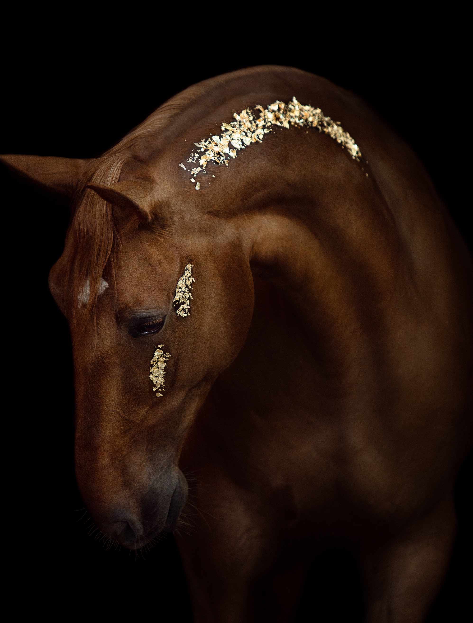
Art included: Arc of Grace by Anna Archinger
Published on: February 04, 2026 Modified on: April 07, 2026 By: Artfully Walls
Previous: What Is Wall Art? A Beginner’s Guide to Styles & Types Next: Soft Surrealism in Wall Art: The Dreamy Trend Defining 2026
