What Is the 2/3 Rule for Wall Art? A Simple Guide to Proportion and Size
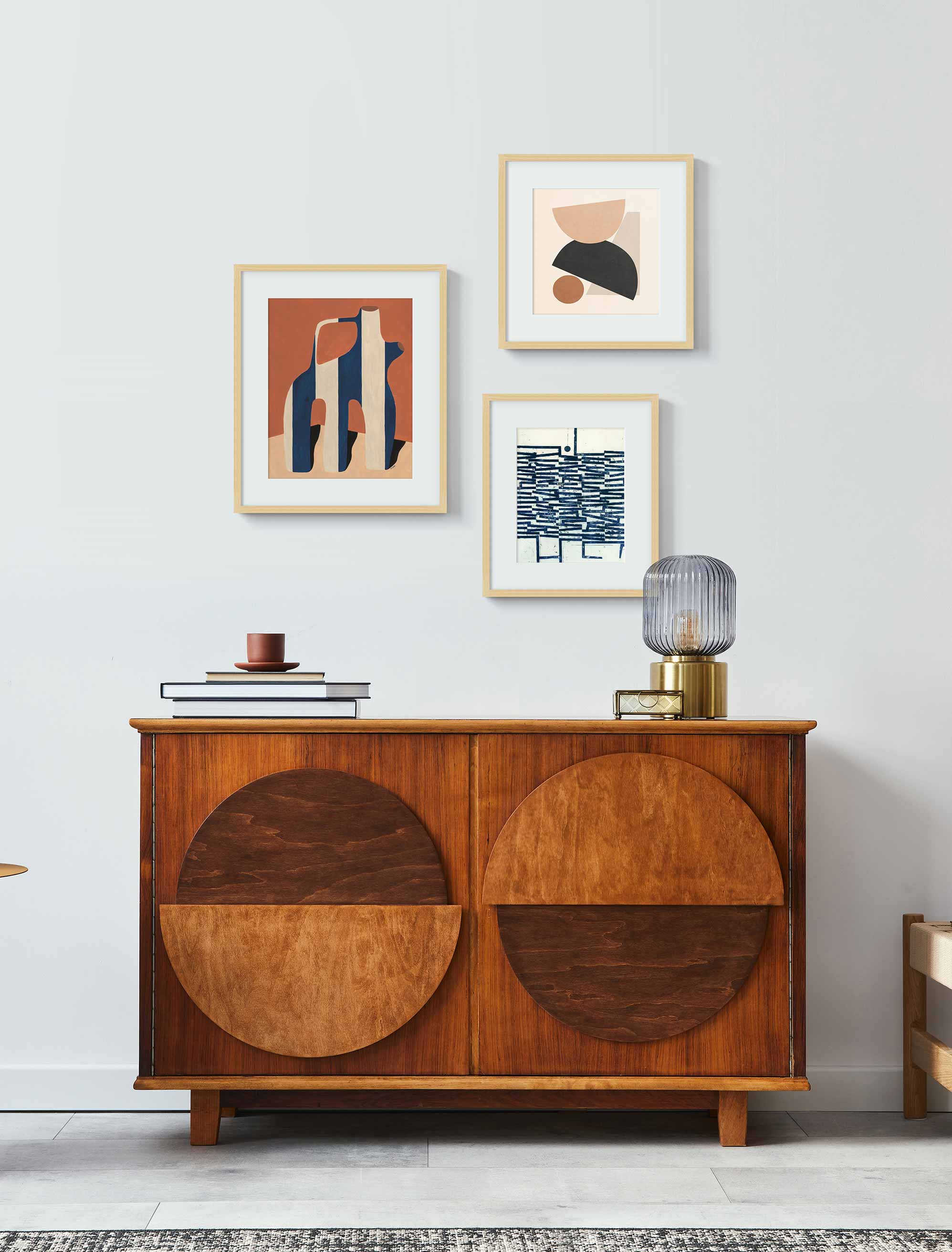
An example of 2/3 wall art placement in a modern living room.
Hanging art can feel like a guessing game. You hold the frame up, step back, second-guess yourself, then shift it an inch either way. The 2/3 rule gives you somewhere solid to start. It is not about strict measurements or getting everything exactly right. It is a simple proportion that helps your art feel like it belongs with the furniture and the space around it.
Here is the gist: your art should take up about two-thirds of the width of whatever sits below it, whether that is a sofa, a bed, or a console. That is usually enough to make a wall feel balanced and considered, without the art looking marooned or crowding everything out. Think of it less as a rule and more as a rhythm, the thing that quietly makes a room feel pulled together.
Key Takeaways
- The 2/3 rule means sizing your art to about two-thirds the width of the furniture beneath it, which keeps a wall balanced and in proportion.
- To find your number, measure the furniture width and multiply by 0.66. A 90 inch sofa, for instance, wants art around 60 inches wide.
- It works just as well for a single statement piece as it does for a grouped gallery wall.
- Treat it as a guide for choosing sizes and planning spacing, not a formula to obsess over.
- Plenty of designers bend it for ceiling height, furniture style, or personal taste, so it is flexible, not fixed.
Understanding the 2/3 Rule: Definition and Origins
At its core, the 2/3 rule is really about proportion. When your art is in scale with the furniture beneath it, the whole arrangement feels grounded, like it was always meant to be there. It draws on the same instinct behind the golden ratio in architecture or the rule of thirds in photography: our eyes simply like a little order.
That is why the extremes tend to feel off. Too small, and a piece looks like it is floating adrift. Too large, and it can feel heavy or a bit overbearing. Landing around two-thirds the width of your sofa, headboard, or console gives you that easy, right-sized look without measuring down to the millimeter.
Want a little more drama? There is a bolder cousin, sometimes called the 3/4 rule. Size your art closer to three-quarters of the furniture width, and it makes more of a statement above a sofa or bed. In practice, anywhere from about 66 to 75% works, which sits right alongside our Wall Art Size Guide and its 50 to 75% range for the same call.
How to Apply the 2/3 Rule in Different Scenarios
The lovely thing about the 2/3 rule is how easily it flexes. Whether you are hanging a single large piece or building a gallery wall, it hands you a starting scale you can adjust from there. Use the quick reference below as your starting point, then read on for how it plays out piece by piece.
Common furniture widths and the art width each one points to:
- A 48-inch console: Art around 32 inches wide
- A 60-inch loveseat or queen bed: Art around 40 inches wide
- A 72-inch sofa: Art around 48 inches wide
- A 76-inch king bed: Art around 50 inches wide
- An 84-inch sofa: Art around 56 inches wide
- A 90-inch sofa: Art around 60 inches wide
If your furniture is not on the list, the math is the same every time: width multiplied by 0.66, rounded to the nearest print size you actually like.
Single Artwork Placement
For a single canvas or framed print, measure the furniture underneath and aim to cover about two-thirds of its width. So if your sofa is 90 inches long, something around 60 inches wide will sit just right. In everyday print sizes, that usually means reaching for a 24x36 or 30x40 above a sofa, while a smaller 18x24 is perfect for a narrow console or that awkward gap between two windows.
Gallery Wall Applications
With a gallery wall, treat the whole grouping as one shape. Add up the width of the pieces plus the gaps between them, and aim for that total to land around two-thirds of the furniture below. Keep 2 to 3 inches between frames and the cluster stays tight and intentional, anchored to the furniture rather than drifting off across the wall.
Furniture Relationship Guidelines
Furniture changes how the rule reads. A deep, substantial sectional can carry a bigger piece, while a slim console usually looks better with something lighter on top. Use two-thirds as your anchor, then let the height, depth, and style of the furniture nudge you up or down.
Wall Space Calculations
When the wall dwarfs the furniture, follow the furniture, not the wall. The two-thirds should relate to the sofa or bed beneath the art, not the whole expanse of paint behind it, which is what keeps a piece from looking lost. And if there is no furniture at all underneath, switch your reference to the wall itself and aim to fill roughly 60 to 75% of that segment.
Not sure how it will all come together? The Artfully Walls Wall Designer lets you preview prints and frames side by side, so you can settle on an arrangement before a single nail goes in. For a grouping, our gallery wall planner takes you through the same process one step at a time.
Height Positioning Standards
Width sorted, give a thought to height: center the art around eye level, and leave a little breathing room between the top of the furniture and the bottom of the frame so the two feel linked rather than stacked. For the exact numbers, our guide on how high to hang pictures has you covered.
2/3 Rule for Wall Art in Every Room: Practical Examples
The 2/3 rule travels well from room to room. It just wears a slightly different outfit in each one. The goal never changes, though: art and furniture in proportion, so the wall looks like someone meant it.
Living Room Artwork Sizing
Above a sofa or sectional, the rule does its best-known work, anchoring the whole seating area. A standard 84-inch sofa pairs beautifully with art around 56 inches wide, whether that is one big canvas or a gallery wall with even spacing. If you are going the single-piece route, extra large wall art for the living room is the bracket to shop from. This art over sofa proportion is the classic use of the rule, and it gives the room a clear focal point without shouting.
Bedroom Wall Art Guidelines
Here, the headboard is your anchor. Over a queen, which runs about 60 inches wide, art around 40 inches feels calm and just right; over a 76-inch king, step up to roughly 50 inches. A piece or set of pieces sized this way keeps the wall restful, which is exactly what a bedroom wants.
Dining Room Display Standards
Above a sideboard or buffet, the rule keeps things in balance. A typical 60-inch sideboard points to art around 40 inches wide. Since these pieces tend to be long and low, a wide horizontal piece or a row of smaller prints spanning two-thirds of the width looks especially at home.
Office and Study Applications
Art hung above a desk or a bookcase works on the same logic. Sizing to two-thirds ties the art to the furniture, so a workspace reads as composed and put-together while still feeling like yours.
When to Break the 2/3 Rule: Exceptions and Alternatives
Like any good guideline, the 2/3 rule is here to help, not to box you in. Some of the best walls come from knowing exactly when to set it aside.
High Ceiling Adaptations
Soaring ceilings can leave a two-thirds piece looking a little lost. Go bigger, fill more of that vertical space, or layer a few works together to match the scale of the room.
Minimalist Design Approaches
In a pared-back space, restraint is the whole point. A smaller piece that sits well under two-thirds can create a quiet, deliberate moment, with the negative space doing just as much work as the art itself.
Statement Piece Strategies
Now and then a single oversized piece deserves the whole stage. Letting it push past two-thirds builds drama and gives the room an unmistakable focal point. As long as it feels intentional, it works.
Architectural Feature Considerations
Fireplaces, windows, and built-ins have a rhythm of their own, and the 2/3 rule does not always slot in neatly around them. When that happens, take your cue from the architecture instead, centering or aligning the art to play off those features.
Common 2/3 Rule Mistakes and How to Avoid Them
The rule is simple, but a few slip-ups catch people out. The good news is that each one is easy to dodge once you know it is there.
Measurement Calculation Errors
The classic mistake is measuring the wall instead of the furniture. Measure the furniture first, every time, then take two-thirds of that for your piece or grouping. Skip that step, and you can end up with the postage stamp effect, a lonely little frame stranded above a big sofa. Measuring the furniture first is how you steer clear of it.
Furniture Scale Misjudgments
Big, weighty furniture wants art with equal presence, while delicate pieces are happier under something lighter. Get that balance wrong, and the art starts to feel disconnected from everything around it.
Multiple Piece Coordination
On a gallery wall, keep thinking of the whole set as one piece. If the combined width does not land near two-thirds of the furniture, the group tends to look either cramped or stretched too thin.
Room Context Oversights
Ceiling height, wall size, and how the room gets used all matter. A piece that sings in a cozy dining room can vanish in a double-height living room, so read the room as much as the tape measure.
Master Perfect Wall Art Placement With the 2/3 Rule
The 2/3 rule takes the pressure off hanging art. It hands you a framework that makes proportion feel easy, while leaving plenty of room for your own taste. Treat it as a jumping-off point, never a rigid formula.
Lean on it for framed prints, canvases, or a full gallery wall and your space falls into balance. And when you choose to break it, you do it on purpose. That is the sweet spot, where a wall looks polished and personal at the same time.
FAQs
What exactly is the 2/3 rule for wall art placement?
It is a simple guideline: size your art to about two-thirds the width of the furniture beneath it, so the two feel balanced together.
How do you measure wall art using the 2/3 rule?
Measure your furniture's width, multiply by 0.66, and use that as the target width for your art or arrangement.
Does the 2/3 rule apply to all wall art sizes?
Yes, though it flexes. It holds up for single pieces, gallery walls, and layered arrangements alike, because it is really about proportion rather than exact size.
Should I follow the 2/3 rule for gallery walls too?
Absolutely, just picture the gallery wall as one overall shape. The combined width of the frames and the gaps between them should come to about two-thirds of the furniture width.
Should art be centered on the wall or over the furniture?
Over the furniture, not the wall. Line the art up with the middle of the sofa, bed, or console beneath it, even if that is not dead center on the wall.
Does the 2/3 rule apply to a wall with no furniture?
Not directly, since there is nothing beneath it to measure against. On a bare wall, aim for a piece or grouping that fills about 60 to 75% of that wall segment instead.
Art Included:
Hidden Depths 1. by Petr Strnad
Abstract Art - T04 by Jaqueline Lima Vera
Published on: September 29, 2025 Modified on: August 13, 2026 By: Artfully Walls
Previous: Get to Know Adrienne Brown-David — Artist Who Captures Childhood Memories Next: Are Gallery Walls Still in Style? A 2025 Guide to This Classic Trend
