How to Choose a Frame for Art: Matching Styles, Colors, and Sizes
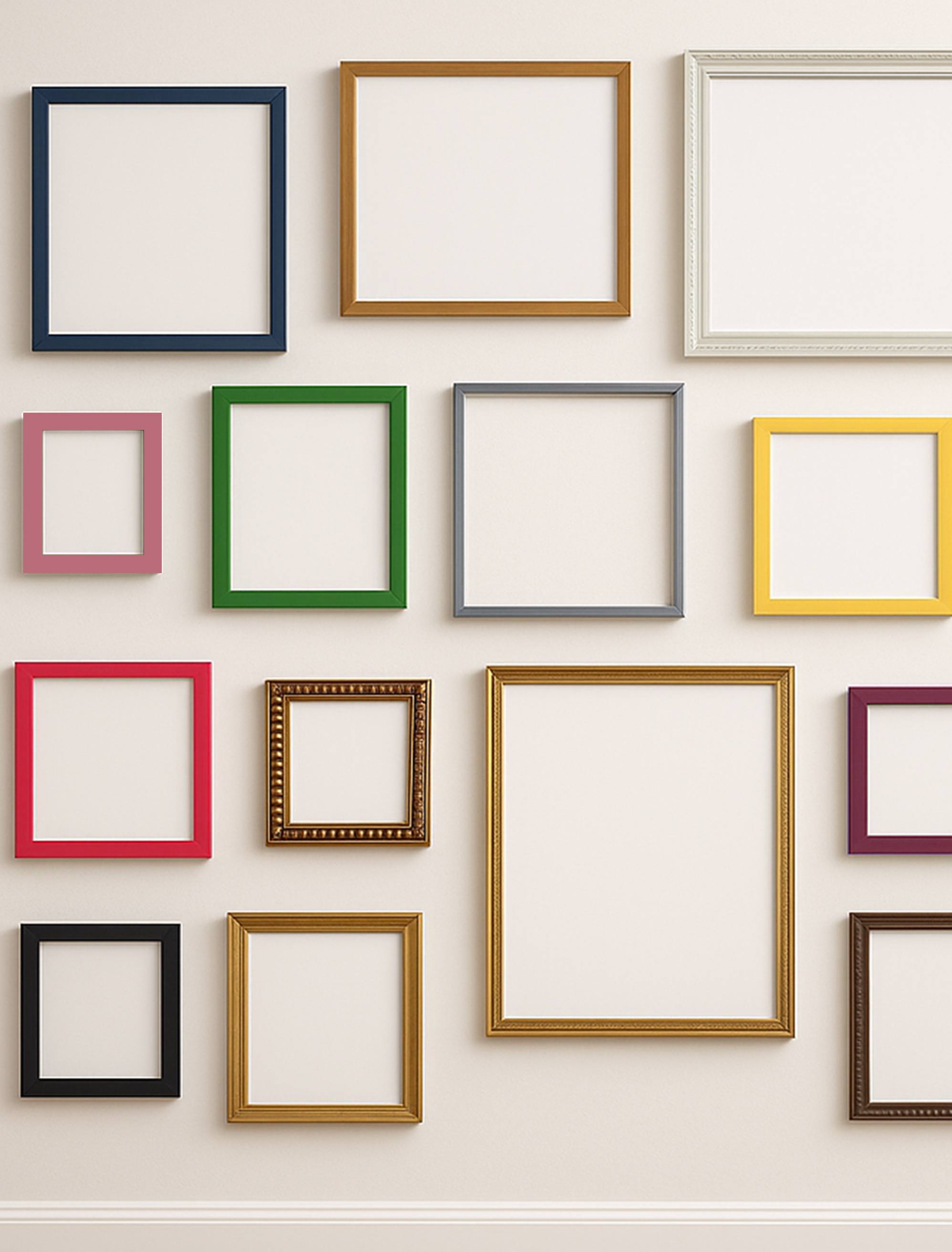
Artfully Walls's portfolio of frames comes in a myriad of colors and styles.
Choosing the right frame can completely transform how a piece of art feels in your home. A thoughtful frame can turn a simple print into a focal point, highlight colors you may not have noticed before, and bring a sense of intention to a room. When the frame works in harmony with the art, it elevates everything around it. When it competes or overwhelms, even the most beautiful artwork can feel out of place.
Since frames come in countless shapes, finishes, and profiles, it is no surprise that choosing one sometimes feels confusing. This guide walks you through the essentials. You will learn how to match frame styles with your artwork, choose colors that complement both the piece and your room, determine frame width and mat proportions, coordinate a gallery wall, and select the right frame for your medium. With a few simple principles, framing becomes less intimidating and more like an extension of your personal style.
Key Takeaways
- A frame should complement the artwork, not compete with it. Consider color, style, subject matter, and overall room décor.
- Traditional ornate frames suit classical art. Simple modern frames work well for contemporary pieces and photography. Rustic frames bring warmth to casual art. Metal and floating frames offer sleek, contemporary options.
- Frame colors can match tones within the artwork, coordinate with your room’s palette, or stay neutral with black, white, or wood.
- Frame width should feel proportional. Smaller pieces look best with thinner frames, while larger artworks need wider profiles.
- Matting creates breathing room around art and can be especially helpful for small works on paper. Many pieces look polished with 2 to 4 inches of mat space, though some artworks do well without a mat at all.
Understanding Frame Styles
Frames come in many personalities, and each one sets a different mood. Getting familiar with the major styles will help you understand which direction enhances your artwork rather than distracting from it.
Ornate Frames: When You Want Drama and Detail
Traditional ornate frames have carved edges, textured finishes, and a sense of old-world elegance. Gold, bronze, and rich wood tones are common. These frames pair beautifully with classical paintings, portraits, and vintage pieces. In a traditional or formal setting, they add presence and depth, creating a moment that feels timeless.
Minimalist Frames: Clean Lines for Modern Work
Modern frames are the opposite. They are simple, slim, and unfussy, usually in matte black, white, natural wood, or brushed metal. They support the artwork without pulling attention away from it. This style is ideal for abstracts, photography, prints, and contemporary pieces, especially in Scandinavian, modern, or minimalist interiors.
Rustic Wood Frames: Warm, Textured, and Relaxed
Rustic frames use natural or distressed wood that feels approachable and lived in. They bring a sense of warmth to landscapes, botanicals, and casual artwork. These frames fit comfortably in coastal, cottage, farmhouse, or eclectic spaces where texture and ease are part of the story.
Floating Frames: A Museum-Quality Lift
Floating frames create the illusion that the artwork is suspended within the frame. They have a deeper profile and a small gap around the edges of the artwork that feels refined and contemporary. They work especially well for canvas pieces and dimensional art because they showcase edges and depth beautifully.
Gallery Frames: Simple, Polished, and Professional
Gallery-style frames replicate the look of museum displays. Clean lines, neutral finishes, and high-quality materials allow the artwork to take center stage. These frames are popular for photography, prints, limited editions, and any piece that you want to present with a professional, elevated look.
Choosing Frame Colors
Frame color plays a huge role in how your artwork is perceived. It can help your art blend softly with a room or create a striking contrast that draws the eye.
Match a Color Already in the Artwork
Pulling a frame color from the artwork itself creates instant cohesion. It can be bold, like matching a rich indigo or deep green, or subtle, like echoing a warm neutral. This approach helps the frame feel like a natural extension of the piece.
Coordinate With Your Room’s Palette
Sometimes the better choice is responding to the room rather than the artwork. Look at your wall color, furniture finishes, or accent tones. A black frame can tie into dark architectural details, while a white frame can echo bright, airy spaces. Natural wood frames often soften modern interiors and warm up cool palettes.
Keep Things Simple With Neutrals
When you want versatility, neutrals are your best friend. Black frames feel classic and crisp. White frames feel fresh and modern. Natural wood frames feel warm and grounded. These options work with almost any artwork and make it easy to build a collection over time.
Consider Metallic Finishes
Metallic frames give a piece a subtle glow. Gold adds warmth and elegance, especially for traditional or warm-toned art. Silver and chrome feel sleek and contemporary. Bronze or brass can nod to vintage styling without feeling heavy.
Determining Frame Size and Proportions
The proportions of a frame matter just as much as its style. The right width and mat size create balance without overwhelming the artwork.
Choosing the Right Frame Width
Small artwork often looks balanced with light, narrow profiles, but a wider frame can work beautifully when it adds intention or echoes elements in the art. Medium-sized pieces typically suit moderate widths, though the right frame is always the one that feels proportionate to the visual weight of the piece. Large artworks can handle wide frames that feel intentional and grounded. The goal is to maintain a consistent visual weight in proportion to the piece's size.
Using Mats to Create Breathing Room
Mats act like a pause around your artwork, giving the eye space to rest before meeting the frame. Two to four inches is a comfortable range for most pieces. Smaller artworks benefit from wider mats to prevent the frame from feeling too dominant. Larger works on canvas often skip mats entirely.
Matching Frames to the Artwork Itself
Different mediums and styles respond differently to framing. Understanding what each one needs helps you choose a frame that supports and protects the piece while bringing out its best qualities.
How to Frame Paintings and Canvas Art
Canvas pieces already have presence, so you have options. Some collectors prefer leaving the edges exposed with a gallery wrap. Others choose a floating frame, which offers a clean, contemporary look while still showing the depth of the canvas. Traditional frames also work if you want something more formal. The key is choosing a frame with enough depth to support the canvas comfortably.
Prints and Posters: Clean and Protected
Prints and posters look their best when protected behind glass with a mat. Modern frames in black or white keep them feeling crisp. Vintage posters have their own charm and can be elevated with frames that nod to their era.
Framing Photography With Intention
Photography thrives in simplicity. Black frames are timeless for black and white images. White or light wood frames soften color photography. Metal frames can give architectural or urban photography a sleek, refined edge. With photos, clarity is everything, so a clean frame usually wins.
Watercolors and Other Works on Paper
Watercolors are delicate and need protection from sunlight and moisture. They benefit from UV filtering glass and generous matting that keeps the artwork from touching the glass surface. Light mats and simple frames help preserve the softness and subtlety of the medium.
Abstract and Contemporary Pieces
Abstract art gives you the most freedom. You can choose something bold that mirrors the artwork’s energy or something minimal that balances it. Modern pieces often look beautiful in floating frames or simple wood profiles, but an ornate frame can create a striking and unexpected juxtaposition that elevates the artwork even further. There is plenty of room to experiment as long as the frame supports the visual rhythm of the piece.
Common Framing Choices That Can Throw Off Your Display
Even thoughtful framing can go wrong when proportions, color, or quality are overlooked. Here are a few places where people often stumble and how to avoid them.
Frames That Feel Too Heavy or Too Light
A small artwork surrounded by a very wide frame can feel overwhelmed. A large piece with a thin frame can feel unfinished. Trust your eye for balance and adjust as needed.
Forgetting About the Room It Lives In
A frame should connect the artwork to the space around it. Ignoring furniture, wall color, or architectural details can lead to a frame that feels disconnected rather than intentional.
Skipping Mats When the Piece Needs Space
Certain pieces, especially small works on paper, benefit from mats that create room to breathe. Without them, the frame can feel tight or crowded.
Using Poor Materials for Valuable Art
Flimsy frames or mats can warp, yellow, or damage the artwork. High-quality framing becomes especially important when the piece has emotional or monetary value.
Framing With Artfully Walls
Artfully Walls offers frames that are chosen with the artwork in mind, so every piece feels finished and elevated the moment it arrives. Designers pair each print with frames that highlight its palette, style, and spirit. If you are framing your own artwork, you can also choose standalone frames in popular sizes like 8x10, 11x14, 16x20, and 24x36, and so many more.
Our frame selection includes everything from clean contemporary profiles to warm natural wood finishes, multiple color options, and even more ornate choices for pieces that call for a touch of classic elegance. All frames are constructed with high-quality materials, proper hanging hardware, and protective glazing to keep your artwork safe. Each option is designed to work beautifully within the Artfully Walls aesthetic, whether you are building a gallery wall or choosing a single standout piece.
Conclusion
Choosing the right frame is less about rules and more about harmony. Start by considering the artwork itself and the space it will live in. Choose a frame style that complements the art, whether that means ornate and traditional or clean and modern. Use color thoughtfully, either by pulling tones from the artwork or coordinating with your room. Keep proportions balanced by matching frame width and mat size to the scale of the piece.
The perfect frame protects, enhances, and elevates your artwork while creating a cohesive feel in your home. When you choose your frame with intention, the result feels polished and personal, turning every artwork into something that truly belongs on your wall.
FAQs
What color frame should I choose for my art?
Choose a color that either echoes a tone in the artwork, coordinates with your room, or stays neutral with black, white, or natural wood.
How wide should a frame be for my artwork?
Many small pieces look great in thin frames, medium pieces in moderate widths, and larger artworks in wider profiles, though the best choice really comes down to the proportions and personality of the piece.
Should I use a mat with my framed art?
Most works on paper benefit from a mat because it creates breathing room and keeps the artwork from touching the glass, but many pieces also look beautiful without one. It really depends on the artwork’s style and the look you want.
What frame style works with modern art?
Simple, modern frames, floating frames, and clean black or white profiles all pair beautifully with contemporary artwork. Ornate frames can also create a striking contrast when you want a more unexpected, curated look.
Published on: December 22, 2025 Modified on: April 07, 2026 By: Artfully Walls
Previous: Get to Know Anna Núñez: Where Faith Meets Abstract Expression Next: Soft Surrealism in Wall Art: The Dreamy Trend Defining 2026
