Dopamine Decor Meets Art History: The Joyful Color Revival
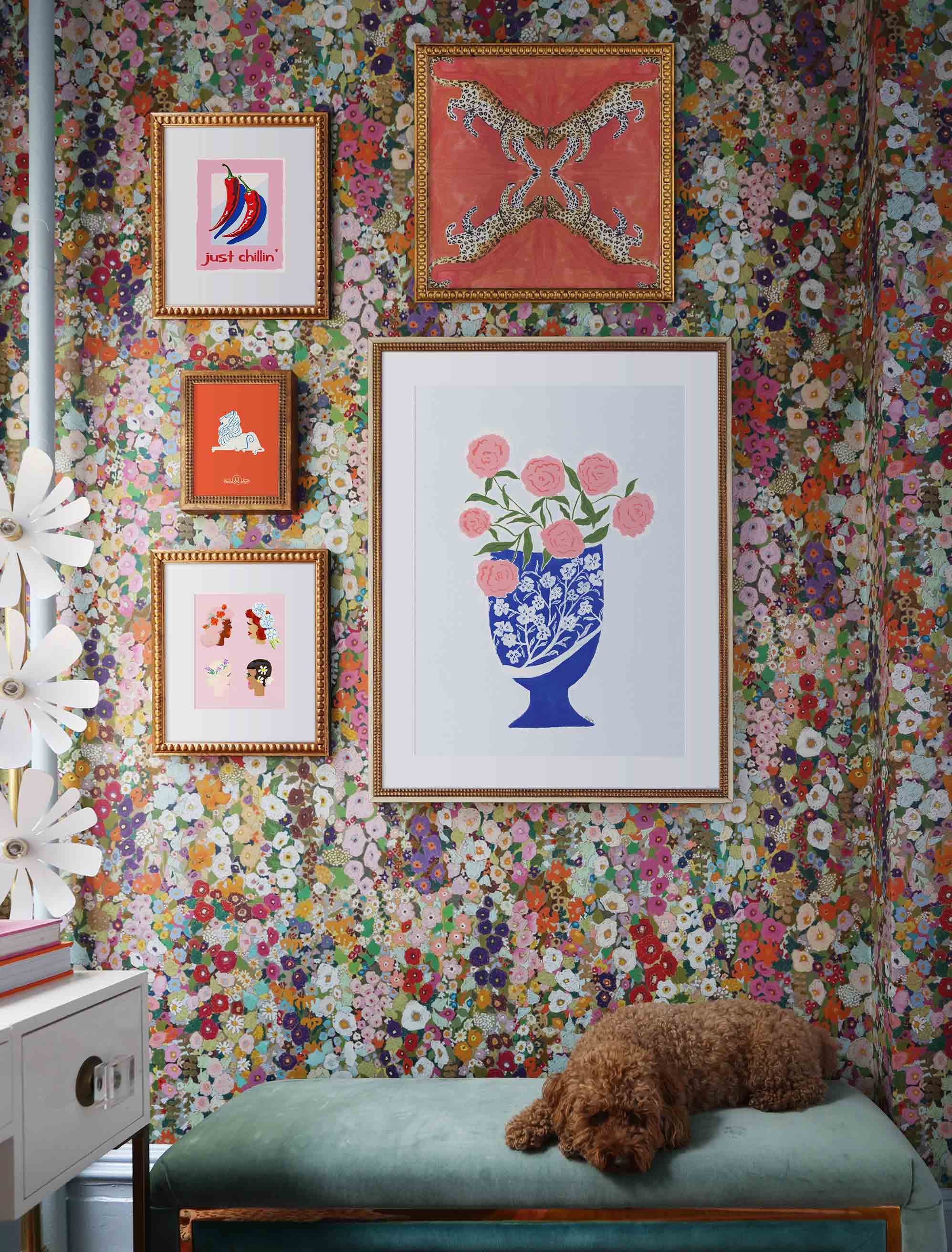
Perfect examples of dopamine decor in a colorful interior.
Scroll through enough interiors right now, and you'll feel the mood before you can name it: hot pink sofas, sunny yellow walls, a clash of candy brights, a warm 70s-groovy haze of orange and brown. This is dopamine decor, the practice of decorating for joy rather than restraint, and it's everywhere. It looks like a brand-new mood, the kind of thing the algorithm decided you needed this season. But bold, saturated color has been lifting rooms (and the people in them) for more than a hundred years, and the wall you just screenshotted is quietly part of a much longer story.
That's what makes the trend more interesting than it first appears. The boldest version isn't the one chasing impact for its own sake. It's the one that knows where this love of color comes from, from the Fauves and the Bauhaus to Pop and the playful clash of the Memphis era. Get that right, and a bold art print stops reading as a fun pop and starts reading as something with a real point of view.
Key Takeaways
- Dopamine decor is the practice of decorating for joy, using bold, saturated color (hot pink, candy brights, 70s warmth, and primaries among them) to lift the mood of a room.
- The look has deep roots in art history, from Fauvism and the Bauhaus to Pop and the playful clash of Memphis design.
- Bold color prints work across far more interior styles than you'd expect, anchoring minimal rooms, energizing neutral ones, and holding their own in maximalist spaces.
- Compositional intelligence is what to look for. A print that uses strong color with graphic discipline reads as art, not decoration, no matter how loud the palette.
- Primary colors are one of dopamine decor's most enduring strands, with the deepest backstory, but they're far from the whole picture.
The Art History Behind the Color
Using color as a language of feeling, rather than just description, has a specific history in Western art. It starts long before the twentieth century, but it's in the modern period that it finds its clearest, boldest voice. Dopamine decor is really borrowing from four of those moments.
Matisse and the Fauves
If dopamine decor has a spiritual ancestor, it's Fauvism. Henri Matisse and the Fauvists used pure, saturated color with a freedom that was radical at the time and still looks arresting now. For them, color wasn't there to describe a thing accurately. It carried the emotion of the work outright, leading the painting rather than serving the drawing.
De Stijl and the Bauhaus
This is where primary colors became a system. Piet Mondrian's neoplasticism, developed through De Stijl in the early 1900s, stripped painting back to red, blue, yellow, black, and white, arranged in grids that chased a kind of universal harmony. The Bauhaus then built a teaching method around the same triad, with Johannes Itten treating red, blue, and yellow as the foundation of all other color, and Paul Klee exploring the feeling of individual hues. It's the lineage behind so much of today's geometric and color-block work.
Pop Art
When Roy Lichtenstein, Andy Warhol, and their peers reached for loud, commercial color, they were quoting the graphic language of printing and mass production on purpose, giving bright color a fresh set of associations, democratic, accessible, and immediate, that stuck around in graphic design ever since.
Memphis and the Joy of Clash
The most direct ancestor of today's look is the Memphis Group, the Milan design collective that erupted in the early 1980s. Drawing on 50s kitsch, Pop, and 60s-70s exuberance, Memphis threw out the rules of good taste: clashing brights, squiggles, polka dots, and bold geometric shapes, all in the name of fun. That playful, more-is-more spirit, full of pink, turquoise, and primary pops, is exactly the energy dopamine decor channels now.
Why Dopamine Decor Works
So why does all this saturated color feel so good? The appeal is part psychological, part practical.
The psychological side first. Research in environmental psychology consistently finds that saturated color at home has measurable effects on mood and energy. The more saturated a color, the more stimulating it tends to read, which is why a wall of candy pink or pure cobalt hits the eye with an immediacy that muted, grayed-off tones can't match.
The practical side is just as real. Bold, saturated color is graphically self-sufficient in a way subtler palettes aren't. A single confident print, whether it's hot pink, cobalt, or a clash of brights, can hold a whole wall and anchor a room without a supporting cast of coordinating tones.
How to Bring Dopamine Decor Home
Bold color rewards slightly different styling choices than tonal work, because its graphic confidence changes how it plays off the colors, furniture, and materials around it.
The Single Statement Piece
One large, saturated print as the only piece on a significant wall gives you maximum impact for minimum fuss. It might be a wash of hot pink, a deep Yves Klein blue, or a Mondrian-influenced grid like Bisected Blue Two by Kristine Facchetti, where red, blue, and yellow bands cross over a vivid red field. It suits minimal and transitional rooms where you want confidence without going fully maximalist.
Filling a big empty wall? An oversized print is where the approach really sings, and the two-thirds rule keeps the scale honest above a sofa or bed.
The Color-Drenched Gallery Wall
Group several bold prints together (a red-blue-yellow trio that nods to De Stijl, or a looser mix of pink, orange, and candy brights) and you get a wall that hums with energy. You'll find plenty to draw from in the abstract collection, and our gallery wall ideas help you test the proportions before you commit.
Color as Accent
Drop a single saturated print into a largely neutral room, and you create a focal point that lives off the contrast between bold and quiet. It's the gentlest way into dopamine decor, and the move behind so many of those white-walled rooms that suddenly feel alive.
Dopamine Decor by Room
Different rooms ask for different things, and the mood each color creates makes some shades more natural in certain spaces than others.
Living Room
The living room is the most natural home for statement color, because a bit of visual energy and social confidence is exactly right here. A large print or a triptych gives you the focal point that a sociable room benefits from. Warm shades like red, coral, and pink bring energy, while blue brings a calmer, unhurried confidence.
Kitchen and Dining
In the kitchen and dining room, warm saturated color stir up visual appetite and social energy, and they work best when the print has a graphic or illustrative quality that suits the lively character of the space. A painterly, color-drenched piece like NY16#11 by Jennifer Sanchez, whose stacked brushstrokes run from blue through green to yellow, brings movement and a sense of fun without feeling fussy.
Home Office
A single, strong print, especially in blue or yellow, gives a home office a focused, energized backdrop without the busyness that pulls your attention away from the work. Yellow's a particularly considered pick, since color psychology links it to creativity and intellectual energy.
Children's Rooms
Bright colors in kids' rooms have a long and justified tradition, rooted in research on how young children respond to color. The trick is choosing prints with genuine graphic quality rather than bright color slapped onto a generic subject. Our kids' room gallery walls lean into that, and The Kids Shop is full of pieces that are bold and considered at once.
Choosing Color With Confidence
The most rewarding way to shop this trend is to bring a little art-historical awareness along with the love of color. It changes both what you look for and how you read a piece.
The markers of real compositional quality are pretty consistent. Look for considered proportions between the color areas rather than a flat, equal split; a composition that would still hold together in black and white; evidence that someone decided which color should dominate and why; and the graphic confidence of a work that knows exactly what it's up to rather than just being loud.
A maximalist room can take a lot of color, but even there, the pieces that last have structure underneath the boldness.
Final Thoughts
Bold, saturated color has been the subject of some of the most rigorous and the most joyful thinking in Western visual culture for over a century. So when dopamine decor brings it home, the result is most interesting when it shows up with that history rather than without it.
A hot-pink, cobalt, or sunshine-yellow wall today is in conversation with Matisse's rooms, the Bauhaus color workshop, and the playful clash of Memphis, whether the owner clocks it or not. Knowing it just makes the conversation richer. If you'd like to start one of your own, the Artfully Walls collection is full of bold-palette prints ready to hang on a wall.
FAQs
What is dopamine decor?
Dopamine decor is the practice of decorating for joy, using bold, saturated color and pattern to lift your mood at home. It spans hot pink, candy brights, 70s-inspired warmth, and bold primaries, and leans playful and maximalist rather than careful and neutral.
How do I bring dopamine decor into a neutral room?
Let contrast do the work. A single bold, saturated print against soft neutral walls becomes an instant focal point, with the calm surroundings making the color feel deliberate rather than chaotic. It's the easiest, lowest-commitment way into the trend.
Does dopamine decor work in a minimal interior?
It can, in small, confident doses. One graphic, saturated piece gives a minimal room a jolt of personality without cluttering it. The key is structure: a composition that would hold up even in black and white.
Can bold color work in a bedroom?
Yes, with a little restraint. A softer or smaller piece, or a deeper, calmer shade like navy or muted pink, brings personality without overstimulating a room meant for rest.
Where does the 70s feel in dopamine decor come from?
Largely from 1970s pop interiors and the postmodern Memphis design movement that followed, which revived clashing brights, squiggles, and bold geometry. That playful, rule-breaking spirit is a big part of what dopamine decor channels today.
Art included: Just Chillin Retro Pop Art Poster by Pat Krygowski, Leopards on Coral by Larsen McDowell, Leo by Danielle Kroll, Flower Ladies by Erica Catherine, Wild Roses by Berry Aktuglu - Atelier Mave
Published on: June 12, 2026 Modified on: June 14, 2026 By: Artfully Walls
Previous: How to Style Black and White Modern Wall Art in Your Living Room
