Butter Yellow – The Creamy, Soft Hue Dominating 2025 Design Palettes
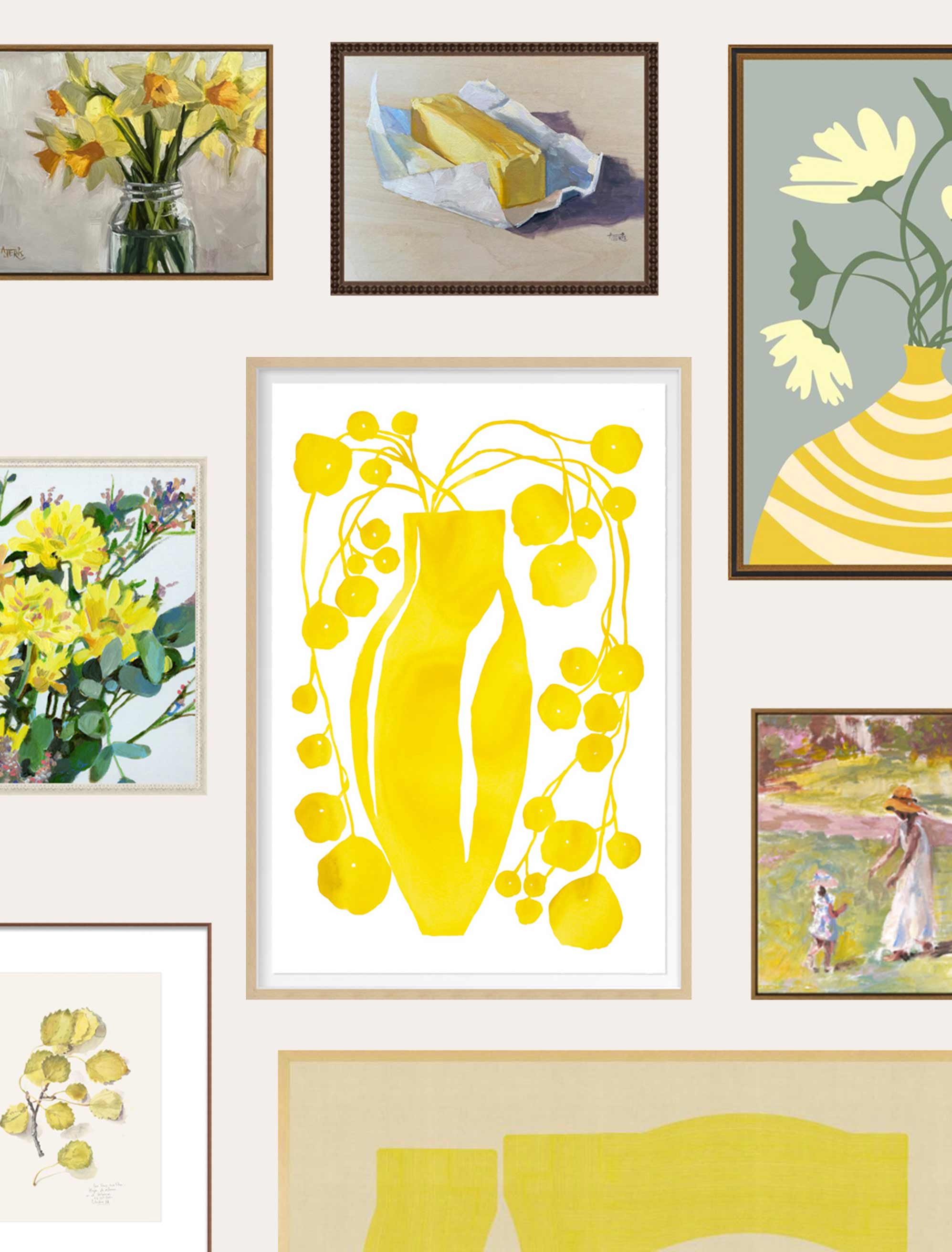
Stunning examples of various art prints with the domination of a butter yellow color.
Key Takeaways
- Butter yellow is leading 2025’s design movement by meeting our deep-rooted desire for warmth, joy, and emotional comfort.
- It brings softness and sophistication to any room, especially when paired with clean whites, natural materials, and matte black.
- Art is one of the most effective ways to incorporate this trend without committing to a full redesign.
- Explore Artfully Walls’ curated collection of butter yellow pieces to find prints that feel fresh, calming, and beautifully current.
The New Mood of Color
Butter yellow has quietly emerged as the defining color of 2025, making its way into home interiors, gallery walls, and designer palettes. What sets it apart from the sharper yellows of previous seasons is its softness. It’s creamy, comforting, and just warm enough to brighten a space without being too subdued.
Whether you’re layering it through framed artwork or using it as an accent wall, butter yellow fits naturally into today's most popular interior styles. It complements both contemporary minimalism and earthy, organic design. And for those not ready to paint a wall, choosing the right piece of art is a low-commitment, high-impact way to try the trend.
How Butter Yellow Art Warms Up a Room
Butter yellow can make a space feel lighter, larger, and more emotionally open. Because it mimics natural sunlight, it works especially well in rooms that already get good daylight. Even in low-light areas, a butter yellow print can introduce a soft, uplifting tone that changes the room’s feel.
Science supports the appeal. Warm yellows are known to trigger serotonin production, helping to boost your mood and energy. When used in art, this color invites you to linger, reflect, and feel at ease, whether you're sipping coffee in the kitchen or winding down in a cozy nook.
You don’t have to go big. Art is the ideal way to bring butter yellow into your space in small, thoughtful doses. A framed print above a bed, a trio of artworks in a hallway, or even one vibrant abstract piece can brighten your home in a lasting, intentional way.
Why Is the Yellow Color Trendy in 2025?
The rise of yellow in 2025 isn’t just about aesthetics. It reflects a wider cultural craving for warmth, hope, and personal connection, especially in uncertain times. Yellow, and especially softer shades like butter yellow, answer that call in a gentle but confident way.
Promotes Optimism
Color psychology shows that yellow tones are linked to joy and energy. Butter yellow in particular hits a sweet spot: it triggers serotonin without the harshness of primary yellow. That makes it ideal for lifting your mood on gray days or combating seasonal fatigue.
Reflects Desire for Warmth
Butter yellow brings an almost nostalgic coziness to a space. It reminds us of sunlight through curtains, fresh flowers on a kitchen table, or warm mornings. These small comforts have become central to how we think about home in 2025.
Complements Sustainable Natural Design
This hue pairs effortlessly with wood, linen, clay, and other natural materials. That makes it a perfect fit for biophilic and sustainable interior styles, which continue to grow in popularity. Butter yellow feels organic, like something you'd find in a flower field or golden hour sky.
Creates Balance
In cooler-toned or minimalist rooms, butter yellow can break the chill and add life without overpowering the design. Used in careful proportions, it brings just the right amount of contrast and movement.
Symbolizes Hope and New Beginnings
Butter yellow isn’t just a soft, pretty shade: it’s emotionally powerful. It’s linked with themes of growth, forward momentum, and emotional clarity, which gives it a deeper presence in today’s design language.
Creates Welcoming Home Spaces
Finally, this is a color that makes guests feel good. Butter yellow adds friendliness and approachability to even the most styled spaces. Whether it’s a hallway, kitchen, or bedroom, the effect is the same: it helps people feel at ease
How to Style Butter Yellow Without Overdoing It
Butter yellow works best when it’s balanced with structure and contrast. Too much of it, and a room can feel overly sweet or washed out. But with the right framing, materials, and layout, butter yellow becomes a refined focal point.
Pair with Clean White Surfaces
Crisp white is butter yellow’s best friend. Pairing butter yellow artwork with white walls or trim creates clarity and keeps the look modern. A soft yellow abstract piece above a bright white console or in a light-filled hallway draws the eye without overpowering the space.
Ground It with Natural Materials
Wood, stone, and greenery give butter yellow a grounded, organic feel. A framed print above a walnut dresser or a butter yellow throw on a linen sofa adds warmth without clashing. These materials also enhance the earthy, sunlit vibe that makes this shade feel so natural.
Add a Touch of Matte Black
Matte black frames, faucets, or pendant lights can instantly modernize your use of yellow. The deep contrast keeps things feeling fresh and structured. It also prevents butter yellow from leaning too pastel or overly vintage, making it fit seamlessly into contemporary settings.
Soften It with Gentle Grays
A soft gray backdrop helps tone down yellow’s brightness while still keeping things light and cozy. A butter yellow print on a charcoal wall or beside gray textiles adds personality while maintaining balance.
Keep the Lines Clean and Simple
In rooms with clean lines and minimal color, a well-placed butter yellow print can do a lot of the visual work. Choose one bold piece, hang it with intention, and let it be the element that brings the whole room to life.
Where Butter Yellow Walls Work Best
Not every room benefits from the same color treatment. Butter yellow works exceptionally well where you want warmth and energy. This hue can make the biggest impact here.
Home Offices That Energize Without Distracting
Place a butter yellow artwork behind or beside your desk to spark energy and brighten up your video calls. Abstracts and organic shapes work particularly well for focus and creativity.
Breakfast Nooks with a Morning Glow
There’s something energizing about starting the day with warm light and color. A framed print near your dining table or above a built-in bench adds comfort and visual joy. Pair it with wood seating and soft textiles for a cozy vibe.
Cozy Corners for Reading or Relaxing
In your bedroom or a quiet reading space, butter yellow can help set a restful but uplifting tone. Choose yellow artwork with gentle transitions and soft details. Look for watercolor or washed pigment styles that promote peace while still lifting the room.
Entryways That Feel Like a Hug
Your entryway is the first impression your home gives. A butter yellow wall or framed print here adds brightness and friendliness to an often overlooked space. It also helps open up narrow hallways, making them feel more inviting.
Inspiration Starts with Nature (and a Little Research)
Butter yellow already exists all around you; you just have to notice it. Think sunflower fields, golden hour skies, and soft autumn leaves. These natural moments offer the perfect reference for how this shade works in real life.
But you can also turn to trusted design resources. Browse curated Instagram accounts, Artfully Walls' collection pages, or AI search. Interior design magazines to see how this hue works in real homes. Look closely at how designers use scale, framing, and supporting colors to make butter yellow art feel intentional and current.
Ready to Bring Butter Yellow Into Your Home?
Butter yellow is more than just a trending color. It reflects the way we want to feel: comfortable, hopeful, and grounded. It gives you a soft but powerful tool for creating spaces that feel warm and alive. Whether you choose one striking print or build a small gallery wall around this gentle color, butter yellow gives you the chance to refresh your space in a way that feels joyful, sophisticated, and timeless.
FAQs
How does butter yellow lighting affect room ambiance and mood?
Butter yellow reflects warm tones and mimics sunlight, which can help improve your mood, especially during darker seasons. It gives off a gentle glow that feels natural and soothing.
How can you balance butter yellow with contemporary design?
Stick to clean lines, simple silhouettes, and neutral tones like white, gray, or matte black. Use texture to add interest and avoid overdecorating with other bright colors.
What artwork styles pair well with butter yellow interiors?
Abstract landscapes, botanical prints, and minimalist line drawings all work beautifully. Look for pieces with natural textures or soft transitions between color tones.
How do you choose the best butter yellow art pieces?
Start with your room’s existing palette. If it’s mostly neutral, go for larger or more detailed yellow art. Opt for smaller accents with subtle yellow tones if your space already has intense color moments.
Art included: Golden Poplar by Catalina Somolinos, Yellow Vase Light by Kate Roebuck, Abstract Composition M277 by Jesus Perea, Everything's Better with Butter by Andrea Jeris, Cut Daffodils by Andrea Jeris, Yellow Flowers by Tali Yalonetzki, A Pot of Cream by Angie Wise, Wild Mist Flower by Charlotte Marie Isbell
Published on: July 22, 2025 Modified on: April 07, 2026 By: Artfully Walls
Previous: Nature's Big Return: Biophilic Art in 2025 Next: Matisse Cut-Outs – Celebrating Iconic Shapes in Contemporary Art and Fashion
